

Walk into any supermarket and watch what your eyes land on first. It’s never the small print. It’s never the ingredient list. It’s the colour of the packet, the shade of the logo, the contrast on the label that either grabs you or lets you walk right past. Most people never notice this happening. That’s the whole point. Colour psychology in marketing works quietly, in the background, shaping how you feel about a brand before you’ve read a single word of copy.
Think about the last time you scrolled through Instagram and stopped on an ad. Chances are, colour did some of that work before the headline even registered. A red “Sale” tag pulls your eye faster than a grey one. A soft green background on a skincare ad feels calmer than a neon orange one. None of this is accidental. Brands spend serious money figuring out which colours make people stop, feel, trust, and eventually buy.
But here’s where a lot of marketing advice gets it wrong. There’s this idea floating around that colour psychology is some kind of universal code, red always means urgency, blue always means trust, green always means eco-friendly. Nope. It’s way messier than that. Context changes everything. Culture changes everything. The industry you’re in changes everything. A blue that feels trustworthy on a banking app might feel boring and forgettable on a children’s toy box.
This guide is built to walk through colour psychology in marketing the way it actually works — not as a checklist of “red equals X, blue equals Y” but as a strategic tool that depends on audience, positioning, culture, and testing. If you’re a marketer, a founder picking your first brand colours, a designer building a client’s visual identity, or a student trying to understand why Coca-Cola never touched their red, this is written for you.
What You Will Learn in This Guide
- What colour psychology actually means in a marketing context, and where it overlaps with colour symbolism
- How individual colours are typically perceived, along with the marketing situations where they work and where they backfire
- How colour choices shift depending on industry — because a hospital and a nightclub should never use the same palette logic
- Why colour meaning is not universal, and how culture reshapes what a colour communicates
- How colour combinations often say more than any single colour on its own
- A step-by-step framework for choosing brand colours that isn’t based on guesswork or personal taste
- How colour plays into digital marketing specifically — websites, CTAs, email, social media, ads
- The most common mistakes marketers make with colour, and how to avoid repeating them
- How to actually test whether your brand colours are working, instead of assuming they are
- Why accessibility has to be part of the colour conversation, not an afterthought
- Real examples of how recognisable brands use colour strategically
- A simple, memorable framework (P.A.L.E.T.T.E.) you can apply to your own brand decisions
What Is Colour Psychology in Marketing?
Colour psychology in marketing is the study of how colours influence people’s perceptions, emotions, associations, and behaviours toward brands, products, and marketing messages. It sits at the intersection of consumer psychology, branding, advertising, and visual design. Marketers use it to shape how a brand feels before a single word of copy gets read, because visual impressions form faster than verbal ones.
This isn’t some fringe theory designers made up to sound smart in client meetings. It draws from real psychological research on perception and emotion, though — and this matters a lot — it’s nowhere near as tidy or predictable as some blog posts make it sound. Colour psychology gives you tendencies and patterns, not laws of nature.
How Colour Influences Perception
Colour affects a surprising number of things at once. It shapes first impressions within seconds of someone seeing a website, product, or ad. It influences emotional associations, which is why a spa uses soft blues and a fast-food joint uses punchy reds. It guides visual hierarchy, pulling the eye toward buttons, headlines, or products that matter most. It even shapes perceived brand personality — whether a company feels playful, serious, premium, or approachable — and perceived product characteristics, like whether a drink looks refreshing or a supplement looks potent.
None of these effects work in isolation. A red CTA button on a cluttered page with ten other red elements does nothing. The same red button on a mostly white page, surrounded by breathing room, does a lot. Colour works through relationships, not in a vacuum.
Colour Psychology vs. Colour Symbolism
People mix these two up constantly, and it’s worth separating them clearly. Colour psychology deals with perception and emotional or behavioural associations — how a colour tends to make someone feel or react, based on cognitive and physiological responses. Colour symbolism, on the other hand, is about cultural and contextual meaning — what a colour represents within a specific tradition, religion, or society.
Red might trigger urgency and heightened arousal on a psychological level almost anywhere. But red also symbolises luck and prosperity in Chinese culture, danger in Western safety signage, and mourning in parts of South Africa. Psychology is closer to biology and cognition. Symbolism is closer to history and tradition. Good marketers understand both, because ignoring either one gets you a campaign that misfires in a market you didn’t research properly.
Is Colour Psychology Scientifically Proven?
Honestly? It’s complicated, and any guide that tells you otherwise is oversimplifying. Research on colour and emotion exists, and some patterns show up repeatedly across studies — warm colours tend to increase arousal, cool colours tend to have a calming effect. But a lot of the popular “colour psychology charts” you see floating around Pinterest are built on shaky or outdated studies, small sample sizes, or claims that got exaggerated as they spread online.
What research can establish is general tendencies under specific conditions. What it can’t establish is that blue “makes” 73% of people trust a brand, or that orange “increases impulse buying by X%” — numbers like that get repeated endlessly without solid sourcing behind them. Context, prior exposure, personal experience, and culture all interact with colour perception in ways a lab study can’t fully capture. Treat colour psychology as a strong starting point for hypotheses, not a guarantee.
Why Marketers Should Care About Colour
Even with all that uncertainty, colour is one of the most cost-effective levers a marketer has. It touches everything — brand identity, packaging, websites, social media, advertisements, calls to action, email marketing, product design, and retail environments. Get it right and it works silently in your favour across every single touchpoint. Get it wrong and you’re fighting an uphill battle where your visuals contradict your message.
How Colours Influence Consumer Behaviour
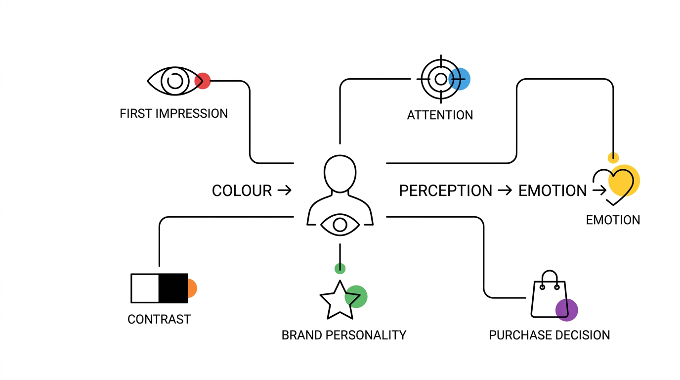
Explain why colour matters in consumer decision-making and how people can form impressions of a brand, product, advertisement, or website within seconds. Discuss how colours can influence emotions, attention, perceived value, trust, urgency, and purchase intent.
Colour and First Impressions
People form an impression of a website, product, or ad within a couple of seconds, and a huge chunk of that snap judgment comes from colour before anyone processes text. This matters enormously for landing pages, packaging design, and advertisements, because you don’t get a second chance at that first two seconds. If the colour feels off for the category — think a bright pink logo on a corporate law firm’s website — visitors register that mismatch instantly, even if they can’t articulate why something feels wrong.
Colour and Attention
Bright, high-contrast colours pull the eye. This is basic visual salience — our brains are wired to notice things that stand out from their surroundings. Marketers use this constantly for CTA buttons, sale badges, and promotional banners. But there’s a trap here: if everything on the page is trying to grab attention, nothing actually does. A page full of shouting colours creates visual clutter, and clutter kills conversion. The smart move is using contrast sparingly, reserving your boldest colour for the one action you actually want someone to take.
Colour and Emotions
Colours can trigger loose associations with specific emotional states — energy, calmness, trust, luxury, connection to nature, urgency, creativity, sophistication. These associations aren’t fixed rules, but they’re consistent enough to build strategy around. A wellness brand leaning into soft greens and blues is tapping into calm and balance. A flash-sale banner in red and yellow is tapping into urgency and energy. The emotional read isn’t guaranteed for every single viewer, but in aggregate, across a large audience, these patterns hold up reasonably well.
Colour and Perceived Brand Personality
Colour helps reinforce specific personality traits a brand wants to project — bold, friendly, premium, innovative, traditional, sustainable, playful, professional. A fintech startup wanting to feel modern and trustworthy at once might lean into a deep blue paired with a sharp accent colour. A children’s education brand wanting to feel friendly and approachable might lean into warm yellows and oranges. The colour becomes shorthand for personality traits that would otherwise take paragraphs of copy to communicate.
Colour and Purchase Decisions
Colour can influence how a product is perceived — its perceived quality, freshness, potency, or premium-ness — which in turn nudges decision-making. That said, be careful about claiming colour “causes” purchases on its own. Nobody buys a product purely because the packaging is orange. Colour works alongside price, positioning, packaging design, copy, and countless other factors. It’s an influence, not a lever you pull in isolation.
The Role of Contrast
Contrast deserves its own mention because it does so much heavy lifting in practical marketing. Contrast between background and foreground determines whether text is readable. Contrast determines whether a CTA button actually stands out or blends into the page. Contrast helps differentiate products on a crowded shelf. And contrast plays directly into accessibility — low-contrast designs exclude people with visual impairments, which we’ll get into later in this guide.
What Does Each Colour Communicate in Marketing?
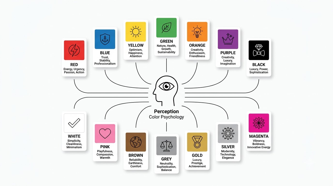
This is the section most people are here for, so let’s go colour by colour. Keep the earlier caveat in mind throughout: these are tendencies and common associations, not universal rules that apply identically to every audience, culture, or brand.
Red: Energy, Urgency, Passion and Action
Common associations: Red tends to trigger associations with passion, energy, excitement, urgency, power, and danger. It’s one of the most physiologically activating colours — some research links red to increased heart rate and heightened alertness, which is part of why it’s used so aggressively in sale and clearance marketing.
Marketing applications: Red shows up constantly in food and beverage branding, entertainment, sports, sales campaigns, calls to action, and promotions. Think of how many “50% OFF” banners use red — it’s not a coincidence.
Strengths: Red is highly attention-grabbing and can build an energetic, high-intensity brand perception fast. It’s hard to ignore, which is exactly why it works so well for urgency-driven messaging.
Risks: Overused, red can feel aggressive or even a little cheap, especially in industries where calm and reliability matter more than excitement. It can also create a false sense of urgency that clashes with a brand meant to feel considered and premium.
When to use red: Action-oriented campaigns, high-energy brands, promotional and clearance messaging, food brands wanting to stimulate appetite.
When to avoid or limit red: Brands aiming for a calm, understated, or luxury-quiet identity — red tends to work against that positioning more than for it.
Blue: Trust, Stability and Professionalism
Common associations: Blue leans heavily into trust, reliability, security, calm, intelligence, and professionalism. It’s probably the single most “safe” colour choice in corporate branding, and there’s a reason for that.
Marketing applications: You’ll see blue dominate finance, technology, healthcare, SaaS, and corporate services. Walk through any list of major banks or tech companies and count how many use blue somewhere in their identity — it’s a lot.
Strengths: Blue creates a professional, dependable perception and works reasonably well across a huge range of business categories without feeling out of place.
Risks: Precisely because it’s so common, blue can become generic fast. If your competitors are all blue, being blue too just makes you blend into the background. Overuse can also make a brand feel a bit cold or distant if it’s not balanced with warmer accent colours.
When to use blue: Categories where trust and security are the primary purchase driver — banking, insurance, healthcare, B2B software, anything where a customer needs to believe you won’t drop the ball.
Yellow: Optimism, Happiness and Attention
Common associations: Yellow taps into happiness, optimism, energy, youthfulness, and general positivity. It’s arguably the most “cheerful” colour in the palette.
Marketing applications: Common in food branding, children’s brands, lifestyle products, entertainment, and promotional campaigns where a burst of energy helps.
Strengths: Yellow is highly visible and creates an energetic visual presence — it’s genuinely hard to miss, which makes it useful for grabbing attention in a crowded feed or shelf.
Risks: Yellow has real readability problems, especially as text on light backgrounds — it strains the eyes fast. It can also come across as overly playful or juvenile for industries that need to feel serious, like legal or financial services.
Green: Nature, Health, Growth and Sustainability
Common associations: Green connects strongly with nature, health, growth, freshness, sustainability, and balance. It’s the go-to colour whenever a brand wants to signal “natural” or “clean.”
Marketing applications: Organic products, healthcare, environmental brands, finance (interestingly, green also signals money and growth), wellness, and agriculture all lean on green heavily.
Strengths: Green has a strong built-in connection to natural and sustainable positioning that’s hard to replicate with other colours.
Risks: Here’s the catch a lot of brands miss — green does not automatically communicate sustainability. Slapping a green logo on a product doesn’t make it eco-friendly, and increasingly savvy consumers see through “greenwashing” that relies purely on colour cues instead of actual sustainable practices. Overuse in a crowded wellness or organic market can also make brands look indistinguishable from each other.
Orange: Creativity, Enthusiasm and Friendliness
Common associations: Orange blends the energy of red with the warmth of yellow, landing on creativity, enthusiasm, friendliness, and approachability.
Marketing applications: Common among startups, consumer brands, entertainment, food, and increasingly, technology companies wanting to feel less corporate and more human.
Strengths: Orange feels more approachable than red while still standing out visually — it’s a genuinely useful middle ground for brands wanting energy without aggression.
Risks: Orange can come across as less premium than other colour choices, and used too heavily, it can start to feel visually overwhelming or loud.
Purple: Creativity, Luxury and Imagination
Common associations: Purple carries associations with luxury, creativity, imagination, mystery, and spirituality — it’s historically been tied to royalty and wealth in many cultures.
Marketing applications: Beauty brands, luxury goods, creative industries, technology, and entertainment all make use of purple’s distinctive positioning.
Strengths: Purple is genuinely distinctive in most competitive landscapes and can build a premium or creative identity without copying the more common black-and-gold luxury playbook.
Risks: Poorly applied, purple can feel disconnected from practical or traditional industries — a purple accounting firm logo, for instance, might feel like a strange mismatch to some audiences.
Black: Luxury, Power and Sophistication
Common associations: Black communicates luxury, power, sophistication, authority, and exclusivity. It’s the default choice whenever a brand wants to feel expensive.
Marketing applications: Fashion, luxury products, premium technology, automotive, and high-end services all lean on black consistently.
Strengths: Black creates a strong premium positioning and generates real visual contrast against almost any other colour paired with it.
Risks: Black can feel intimidating or unapproachable if not balanced carefully, and using it for large blocks of text creates real accessibility problems around readability.
White: Simplicity, Cleanliness and Minimalism
Common associations: White signals simplicity, cleanliness, purity, space, and modernity. It’s the backbone of minimalist design across most industries.
Marketing applications: Healthcare, technology, minimalist brands, luxury, and architecture all rely on white space heavily.
Strengths: White creates clean, uncluttered layouts and does the important job of making other colours in the palette stand out more.
Risks: Used without warmth elsewhere in the design, white can feel sterile or cold. It’s also worth noting that white’s meaning varies significantly across cultures — more on that in the cultural section below.
Pink: Playfulness, Compassion and Femininity
Common associations: Pink typically taps into romance, softness, playfulness, compassion, and youthfulness, though the specific shade matters enormously — hot pink reads very differently from dusty rose.
Marketing applications: Beauty, fashion, lifestyle, wellness, and increasingly food and beverage brands looking for a distinctive, warm identity.
Strengths: Pink carries a strong emotional personality, and its wide range of shades allows for very different positioning — from playful and youthful to soft and premium.
Risks: Marketers should avoid leaning purely on outdated gender stereotypes when choosing pink. Plenty of successful brands use pink well outside the traditional “feminine product” box, and locking pink into that narrow lane limits its potential.
Brown: Reliability, Earthiness and Comfort
Common associations: Brown communicates nature, warmth, reliability, comfort, and tradition — it’s a grounded, unglamorous colour that works in its favour for certain categories.
Marketing applications: Coffee brands, food, agriculture, outdoor brands, and handmade or artisanal products all use brown effectively.
Risks: Poorly combined, brown can look dull or dated fast. It needs careful pairing with brighter accent colours to avoid feeling flat.
Grey: Neutrality, Sophistication and Balance
Common associations: Grey leans into professionalism, neutrality, sophistication, balance, and a modern, technical feel.
Marketing applications: Corporate brands, technology, automotive, luxury, and B2B services use grey as a foundation colour constantly.
Risks: On its own, grey can feel cold or uninspiring — it almost always needs a stronger accent colour to avoid coming across as forgettable.
Gold: Luxury, Prestige and Achievement
Common associations: Gold ties directly to wealth, prestige, success, exclusivity, and celebration.
Marketing applications: Luxury goods, awards and recognition programs, premium products, hospitality, and financial services lean on gold heavily.
Risks: Overused, gold can look flashy or cheap rather than premium — it’s a colour that demands restraint to work well.
Silver: Modernity, Technology and Elegance
Common associations: Silver connects with technology, innovation, precision, modernity, and sophistication.
Marketing applications: Electronics, automotive, technology, and industrial brands use silver to signal precision engineering and a modern feel.
Colour Psychology in Branding
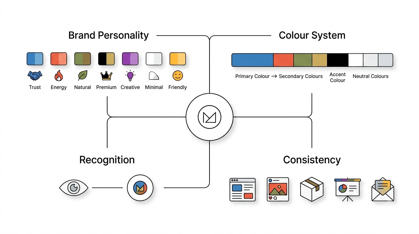
Focus on how businesses use colour to build brand identity and communicate positioning. Explain how a brand’s colour palette can influence whether it feels trustworthy, energetic, premium, youthful, natural, professional, or innovative.
Why Colour Is a Critical Part of Brand Identity
Colour does a lot of quiet, structural work inside a brand identity. It supports recognition — people remember Coca-Cola’s red before they remember the font. It supports differentiation from competitors in a crowded category. It supports consistency across every single touchpoint a customer encounters. And it supports emotional positioning, giving a brand personality traits that would take far longer to establish through words alone. Strip colour out of a brand and you’re left communicating everything through typography and copy, which is a much harder, slower job.
Choosing a Colour Based on Brand Personality
A useful starting framework connects brand personality traits to colour directions, though these should be treated as a jumping-off point rather than a rulebook.
| Brand personality | Potential colour directions |
|---|---|
| Trustworthy | Blue |
| Energetic | Red / Orange |
| Natural | Green / Brown |
| Premium | Black / Gold |
| Creative | Purple / Orange |
| Minimalist | White / Grey |
| Friendly | Yellow / Orange |
These pairings work as hypotheses to test, not conclusions to lock in immediately. A brand can absolutely break from these patterns and succeed — differentiation sometimes means deliberately going against category convention.
Primary, Secondary and Accent Colours
A working colour system typically breaks into a few roles. The primary brand colour is the dominant hue tied most strongly to brand recognition — think Tiffany’s signature blue. Secondary colours support the primary colour and add flexibility across different contexts. The accent colour is usually reserved for calls to action and things that need to pop against the rest of the palette. And neutral colours — usually whites, greys, or blacks — handle backgrounds, text, and the quieter parts of a design that shouldn’t compete for attention.
Building a Consistent Colour System
Colour only works as a branding tool if it stays consistent everywhere a customer encounters the brand — website, logo, packaging, social media, advertising, presentations, and email marketing. Inconsistency dilutes recognition fast. If your Instagram feed uses one blue and your website uses a slightly different blue and your packaging uses a third, you’re quietly training your audience to not notice your colour at all. Documenting exact HEX and RGB values isn’t a bureaucratic exercise — it’s what keeps a brand looking like itself across a hundred different touchpoints and a dozen different people producing the assets.
How Colour Psychology Changes by Industry
Explain why there is no universally correct colour for every business. A colour that works well for a food brand may communicate something completely different for a financial institution, healthcare company, luxury brand, or technology business.
Technology and SaaS
Tech and SaaS brands lean heavily on blue, purple, black, and green, often within gradient-based, modern palettes. The tension here is between trust and innovation — too safe and blue-heavy, and a startup looks like every other SaaS product; too experimental, and it risks looking untested or unstable to a B2B buyer evaluating dozens of vendors.
Finance and Banking
Finance and banking brands mostly stick to blue, green, and dark neutrals. This isn’t creative laziness — trust, security, and stability are the entire value proposition in this category, and colour choices reinforce that message at a glance, before a prospective customer reads a single line about interest rates or fees.
Healthcare
Healthcare brands gravitate toward blue, green, and white. The combination reinforces cleanliness, calmness, and trust — three things a patient desperately wants to feel before walking into a clinic or trusting a health app with sensitive information.
Food and Restaurants
Food and restaurant branding uses red, yellow, orange, green, and brown constantly, tapping into appetite, warmth, and freshness. Fast food in particular leans on red and yellow because those colours are genuinely linked to appetite stimulation and quick decision-making — useful when the goal is getting someone to order fast, not linger over a menu.
Fashion and Luxury
Fashion and luxury brands favour black, white, gold, and restrained neutral palettes. Exclusivity and sophistication are the core message, and busy, saturated colour schemes tend to work against that — luxury branding almost always benefits from restraint over abundance.
Beauty and Cosmetics
Beauty and cosmetics brands use pink, purple, black, nude tones, and white, though the specific direction shifts a lot based on positioning. A mass-market drugstore beauty brand and a high-end skincare line might both use pink, but very different shades and intensities of it, communicating completely different price points and audiences.
Environmental and Sustainable Brands
Environmental and sustainable brands typically lean on green, brown, beige, and earth tones. The real danger here, worth repeating, is treating green as a shortcut for sustainability. Consumers are getting sharper at spotting greenwashing, and a green logo without genuine sustainable practices behind it can backfire into skepticism rather than trust.
Education
Education brands often mix blue, yellow, orange, and purple, trying to balance credibility with engagement. Too much blue and a learning platform feels stiff and corporate; too much bright colour and it risks feeling like it’s not taken seriously by adult learners or institutions.
Real Estate
Real estate branding tends toward blue, green, gold, black, and neutral tones, connecting colour with trust, premium positioning, and stability — all things a buyer wants to feel before committing to the biggest purchase of their life.
How Culture Changes Colour Meaning
This section should introduce the important idea that colour meanings are not universal.
Explain how cultural traditions, religion, history, geography, social conventions, and local experiences can influence how people interpret colours.
Why Colour Meanings Aren’t Universal
This section matters more than most marketing guides give it credit for. Colour associations shift based on country, religion, tradition, history, industry, and demographics. A colour meaning that feels obvious in one market can be completely irrelevant, or worse, actively wrong, in another. Global brands that skip this step risk campaigns that misfire badly in markets they assumed would respond the same way as their home market.
Red Across Cultures
In Western contexts, red often signals danger, urgency, or passion. In Chinese culture, red carries associations with luck, prosperity, and celebration — it’s the dominant colour at weddings and during Lunar New Year, the opposite emotional register from “stop” or “danger.” This is exactly why global brands need localised research before assuming a colour choice translates cleanly across markets.
White Across Cultures
White reads as purity, simplicity, and cleanliness in much of the Western world — think wedding dresses and minimalist design. But in several East Asian cultures, white is traditionally associated with mourning and funerals. A Western skincare brand launching in a new market without checking this could unintentionally send a very different emotional signal than intended.
Yellow, Green and Other Colours
Meanings keep shifting the further you dig. Yellow can represent happiness and warmth in some cultures and caution or even cowardice in others. Green, tied to nature and growth broadly, carries specific religious significance in Islamic culture, where it’s associated with paradise and is used prominently in religious contexts. None of these associations are “wrong” — they’re just specific to their context, and assuming one culture’s colour logic applies everywhere is a mistake that shows up in international marketing failures again and again.
What Global Marketers Should Do
The practical takeaway is straightforward, even if it takes real effort to execute. Conduct local audience research before finalising a palette for a new market. Test campaigns regionally rather than assuming a global rollout of the same visual identity. Avoid assuming Western colour psychology frameworks apply everywhere by default. And review packaging and advertising with local experts who understand the cultural nuance a foreign marketing team simply won’t catch on their own.
Colour Combinations and What They Communicate
Individual colours matter, but combinations often carry more weight than any single hue on its own. How colours sit next to each other changes the entire read of a design.
Blue + White
This pairing communicates trust, cleanliness, professionalism, and simplicity. It shows up constantly in healthcare, SaaS, and corporate websites because it hits multiple trust signals at once without feeling cold or intimidating.
Black + Gold
Black and gold together communicate luxury, prestige, and exclusivity almost instantly. It’s a heavily used combination in premium branding precisely because it works so reliably — though that also means it can feel a bit predictable if not executed with some distinctive detail.
Green + White
This combination reads as freshness, health, and nature. It’s a common choice for wellness and organic brands looking to signal cleanliness alongside their natural positioning.
Red + Yellow
Together, these communicate energy, urgency, and excitement, which is exactly why so much fast food and clearance-sale branding leans on this exact pairing. It’s loud, fast, and hard to miss — good for impulse-driven categories, less good for anything meant to feel considered or slow.
Purple + Pink
This pairing communicates creativity, playfulness, and a lifestyle-driven personality. It’s popular among beauty and youth-oriented brands wanting to feel distinctive and fun rather than corporate.
Blue + Orange
Blue and orange sit at opposite ends of the colour wheel, so together they communicate a blend of trust and energy, or professionalism and friendliness. It’s a genuinely effective combination for brands trying to feel both credible and approachable at once.
Black + White
The classic combination communicates minimalism, sophistication, and contrast. It’s timeless precisely because it never competes with a brand’s other visual elements — it just frames them.
How Contrast Changes Perception
Beyond the specific hues involved, contrast itself shapes perception. Hue, saturation, and brightness all interact with background choices and typography to determine whether a design feels balanced or chaotic. High contrast tends to feel bold and modern; low contrast tends to feel soft and understated. Neither is inherently better — it depends entirely on what the brand is trying to communicate.
How to Choose the Right Colours for Your Brand
Turn the previous concepts into a practical brand-colour selection process.
Explain how marketers can move from “I like this colour” to a strategic colour decision.
Step 1: Define Your Brand Personality
Start by getting specific about how customers should describe the brand if asked. Professional? Friendly? Premium? Innovative? Affordable? Sustainable? This sounds basic, but skipping it is exactly why so many brand colour decisions end up arbitrary — picked because someone liked the colour personally, not because it matched any strategic goal.
Step 2: Understand Your Target Audience
Colour perception isn’t uniform across every demographic. Consider age, location, culture, preferences, expectations, and buying behaviour. A colour palette that resonates with a 22-year-old audience on TikTok will likely feel wrong for a 55-year-old B2B buyer evaluating enterprise software, and vice versa.
Step 3: Study Competitors
Look at the dominant colours across your competitive set. This tells you two things — industry conventions worth respecting (because sometimes conventions exist for good reasons, like blue in finance), and differentiation opportunities where standing out from a sea of sameness could actually help your brand get noticed.
Step 4: Choose Your Primary Colour
With personality, audience, and competitive landscape mapped out, select a primary colour that genuinely supports the positioning you’re going for. This is the colour that should become synonymous with your brand over time, so it deserves the most deliberate thought in the entire process.
Step 5: Build Supporting Colours
Once the primary colour is locked, build out a secondary colour, an accent colour for CTAs and key actions, and a neutral palette for backgrounds and text. A single colour rarely does all the work alone — the supporting cast matters just as much for a functional, flexible system.
Step 6: Check Readability and Accessibility
Before finalising anything, evaluate text-to-background contrast, button visibility, navigation clarity, form usability, and how the palette holds up on mobile interfaces specifically, since screen size and lighting conditions change how colour reads in the real world.
Step 7: Test the Palette
Don’t treat your first palette as final just because it looks good in a mockup. Use A/B testing, gather customer feedback, run usability testing, and track ad performance and conversion data to see how the palette actually performs with real people making real decisions, not just how it looks in a design file.
Step 8: Document the Colour System
Once you’ve landed on something that works, document it properly — HEX, RGB, and CMYK values, usage rules, approved background combinations, and accessibility requirements. This becomes the reference every designer, marketer, and vendor uses going forward, and it’s what keeps the brand looking consistent as more people touch the visual identity over time.
Colour Psychology in Digital Marketing
Move from traditional branding into websites, social media, email marketing, advertising, landing pages, and digital products.
Explain how colour affects digital experiences and user behaviour.
Website Design
On a website, colour shapes navigation clarity, hero section impact, CTA visibility, form usability, and overall trust signals. A visitor decides within seconds whether a site feels credible, and colour is doing a huge share of that work before they’ve read the headline.
Call-to-Action Buttons
There’s no universally “best” CTA colour, no matter how many blog posts claim otherwise. What actually matters is contrast against the surrounding page, visibility within the overall layout, appropriateness for the context, consistency with the rest of the brand, and alignment with what users generally expect a clickable button to look like. A green CTA on a page dominated by green will disappear. The same green CTA on a mostly neutral page will pop immediately.
Social Media Marketing
On social platforms, colour supports brand recognition across a crowded feed, keeps a profile grid feeling consistent, strengthens thumbnail design for video content, and reinforces the overall visual identity every time someone scrolls past a post without even reading it.
Email Marketing
In email, colour influences hierarchy — guiding the eye toward the most important content first — CTA visibility within a cluttered inbox environment, brand recognition across dozens of emails a subscriber receives weekly, and basic readability, especially for people checking email quickly on a phone screen.
Advertising
In advertising specifically, colour needs to stop a scroll, establish message hierarchy fast, set an emotional tone before the copy does its job, and match what the target audience actually expects to see from a credible ad in that category.
Common Colour Psychology Mistakes Marketers Make
Mistake 1: Treating colour meanings as universal. The idea that “red always means urgency” or “blue always means trust” ignores everything about context, culture, and audience covered earlier in this guide. Treat colour associations as tendencies, not laws.
Mistake 2: Choosing colours based only on personal preference. A founder’s favourite colour isn’t automatically the right colour for their brand. The palette needs to serve the audience and the positioning, not one person’s taste.
Mistake 3: Copying competitors. Using the same colour as everyone else in your category might feel safe, but it also makes differentiation nearly impossible. Sometimes the smartest move is deliberately picking a colour nobody else in your space is using.
Mistake 4: Using too many colours. A palette with too many competing hues creates confusion, weakens visual hierarchy, and makes consistency across touchpoints much harder to maintain.
Mistake 5: Ignoring accessibility. Skipping proper contrast ratios and colour-blind-friendly design choices excludes a real, meaningful portion of your audience from using your product or reading your marketing properly.
Mistake 6: Using colour without testing. A palette that looks attractive in a design file isn’t automatically effective commercially. Assumptions need to be checked against real performance data.
Mistake 7: Changing colours across channels. Inconsistent colour use across website, packaging, and social media dilutes recognition and makes a brand harder to remember.
Mistake 8: Using trends instead of strategy. A trendy palette that feels fresh today can look dated within a couple of years, while a strategically chosen palette tends to age far better.
Colour Psychology vs. Colour Trends
This section should distinguish between strategic colour selection and temporary design trends.
Explain why marketers should not completely redesign their brand simply because a particular colour palette is popular on social media or in current design trends.
Why Trends Change
Colour trends shift because of design movements, evolving technology, social media aesthetics, and broader cultural shifts. What felt fresh five years ago — think the pastel gradients that dominated app design for a while — can start to feel dated fast as new aesthetics take over.
Should Brands Follow Colour Trends?
There’s no single right answer here. Trends make sense for campaigns, seasonal content, or product lines meant to feel current and temporary. Trends make less sense for a core brand identity, where consistency and recognition matter more than staying on top of whatever’s fashionable this quarter.
Evergreen Colour Strategy
An evergreen approach prioritises brand positioning, audience fit, meaningful differentiation, accessibility, and long-term recognition over chasing whatever colour palette is trending on design blogs this month. The brands that still look relevant a decade later are usually the ones that built their colour choices around strategy, not fashion.
How to Test Whether Your Brand Colours Are Working
Explain that colour decisions should be validated rather than based entirely on assumptions or personal opinions.
A/B Testing
Run structured tests on CTA colours, ad creatives, landing page palettes, and email designs. Small colour changes can produce measurable shifts in performance, but you only find out by actually testing rather than assuming.
Conversion Metrics
Track click-through rate, conversion rate, engagement, general on-page behaviour, and ultimately revenue or lead generation tied to specific colour choices. These numbers tell you far more than gut feeling ever will.
Qualitative Testing
Beyond raw numbers, gather qualitative input through customer interviews, surveys, focus groups, and usability testing sessions where you can watch how real people react to a palette in real time.
Brand Perception Research
Ask customers directly what words come to mind when they see your visual identity. If the answers don’t match the personality you’re trying to project, that’s a signal your colour choices might be working against you rather than for you.
Don’t Test Colour in Isolation
One important caution: colour never performs in a vacuum. Copy, layout, the actual offer, imagery, and audience all affect performance simultaneously. If a test shows a colour change “worked,” dig into whether it was really the colour or something else that shifted alongside it.
Colour Accessibility in Marketing
Explain why effective colour psychology must also account for accessibility and usability.
A colour combination can look beautiful but still make content difficult for some users to read or interact with.
Why Accessibility Matters
A colour palette needs to work for as many people as possible, not just the design team that approved it in a meeting. Ignoring accessibility isn’t just an ethical gap — it’s a practical one that costs conversions and excludes real customers.
Colour Contrast
Pay close attention to contrast between text and background, buttons and their surrounding background, and different UI states like hover or active buttons. Poor contrast makes content genuinely difficult or impossible to read for a meaningful chunk of any audience.
Don’t Communicate Information Through Colour Alone
A common failure looks like this: an error message shown only through red text with no other indicator. Better practice combines colour with an icon and clear text, so the message still gets across for someone who can’t perceive the colour difference at all.
Designing for Colour Vision Deficiencies
Red-green colour vision deficiency is the most common form, affecting a meaningful percentage of men in particular, and blue-yellow deficiencies exist too, though less commonly. Good design compensates with labels, icons, patterns, and text rather than relying purely on hue to convey meaning.
Accessibility as Part of Good Marketing
Accessibility isn’t separate from good marketing — it’s part of it. It connects directly to usability, inclusivity, a better overall user experience, and ultimately, brand trust. A brand that clearly thought about accessibility signals care and attention to detail that customers notice, even subconsciously.
Real-World Brand Examples: How Companies Use Colour
Coca-Cola — Red. Coca-Cola’s red isn’t just eye-catching, it’s tied to energy, excitement, and decades of consistent use that’s made the specific shade almost legally protected in the public’s mind. The lesson here is consistency compounds — the same red, unchanged, for over a century, is what built that recognition.
Facebook/Meta — Blue. Facebook’s blue signals trust and reliability in a category — social networking with personal data — where trust concerns run deep. The choice reinforces safety even as the platform’s reputation has had its ups and downs over the years.
Starbucks — Green. Starbucks’ green ties into calm, quality, and a slightly premium, natural feel that separates it from cheaper, faster coffee competitors leaning on red and yellow.
McDonald’s — Red/Yellow. This combination is a masterclass in appetite stimulation and speed — the colours are practically engineered to feel fast, energetic, and impossible to ignore from a moving car.
Tiffany & Co. — Blue. Tiffany’s specific shade of blue, trademarked and instantly recognisable, signals luxury and exclusivity through a colour choice that deliberately avoids the more expected black-and-gold luxury playbook.
Cadbury — Purple. Cadbury’s deep purple communicates indulgence and a slightly regal, premium feel within the chocolate category, differentiating it clearly from browns and reds used by many competitors.
Nike — Black/White. Nike’s stripped-back black-and-white identity lets the swoosh and the product photography do the talking, reinforcing a bold, minimal, performance-driven personality.
Apple — Minimal Neutral Palette. Apple’s near-total avoidance of bold brand colour reinforces simplicity and premium minimalism, letting the product design itself carry the visual identity instead of a signature hue.
The lesson across every one of these examples isn’t “use this specific colour.” It’s that the strategic relationship between the visual identity, the audience, the industry, and the positioning is what actually makes the colour choice work — the colour itself is just the visible output of that deeper strategy.
A Practical Colour Psychology Framework for Marketers
Use the final section to bring the entire article together into a repeatable framework marketers can actually use.
The P.A.L.E.T.T.E. Framework
Here’s a simple framework worth keeping in your back pocket whenever you’re making a colour decision for a brand.
P — Positioning. What should the brand stand for in the market? Every colour decision should trace back to this answer.
A — Audience. Who is the brand actually talking to, and what visual language resonates with that specific group?
L — Landscape. What colours already dominate the category, and where’s the room to stand out without feeling completely alien to the space?
E — Emotion. What feelings should the palette encourage in someone encountering the brand for the first time?
T — Tone. Does the colour genuinely match the personality the brand is trying to project, or is there a mismatch worth addressing?
T — Testing. Does actual audience behaviour support the colour choice, or is it purely based on assumption and taste?
E — Experience. Does the palette hold up consistently across every single touchpoint a customer might encounter — web, print, social, packaging, email?
Running a colour decision through these seven checkpoints catches most of the common mistakes covered earlier in this guide before they ever make it into a final brand guideline.
Quick Colour Psychology Reference Table
| Colour | Common associations | Typical marketing uses | Potential downside |
|---|---|---|---|
| Red | Energy, passion, urgency | Food, sports, promotions | Aggression |
| Blue | Trust, stability | Finance, SaaS, healthcare | Can feel cold |
| Yellow | Happiness, optimism | Food, lifestyle | Poor readability |
| Green | Nature, health, growth | Wellness, sustainability | Can feel generic |
| Orange | Energy, friendliness | Startups, consumer brands | Less premium |
| Purple | Creativity, luxury | Beauty, creative brands | Can feel niche |
| Black | Power, luxury | Fashion, premium | Can feel intimidating |
| White | Simplicity, cleanliness | Healthcare, tech | Can feel sterile |
| Pink | Playfulness, softness | Beauty, lifestyle | Stereotyping risk |
| Brown | Warmth, earthiness | Food, coffee, outdoor | Can feel dull |
| Grey | Neutrality, sophistication | Corporate, tech | Can feel bland |
| Gold | Prestige, luxury | Premium brands | Can feel excessive |
Conclusion
Colour is more than decoration sitting on top of a logo or a landing page. It’s part of how a brand communicates, often before a customer reads a single word of copy. Everything covered in this guide points back to the same core principles: context matters, culture matters, audience matters, industry matters, accessibility matters, and testing matters more than any of them individually.
The wrong question to ask is “which colour is universally best?” That question doesn’t have a real answer, no matter how many charts and infographics claim otherwise. The right question is “which colour communicates the right message to this audience, in this context, for this specific brand?” That question actually has an answer, and finding it takes real work — audience research, competitor analysis, testing, and a willingness to document and stay consistent once you land on something that works.
Choose colour strategically. Build a consistent system across every touchpoint. And validate the choice with real audience behaviour rather than personal preference or whatever’s trending this year. Get that right, and colour becomes one of the quietest, most effective tools in the entire marketing toolkit.
Frequently Asked Questions
What is colour psychology in marketing?
It’s the study of how colour choices influence how people perceive, feel about, and behave toward a brand or product. It touches everything from packaging to websites to advertising, working quietly in the background of nearly every marketing decision.
Why is colour important in branding?
Colour builds recognition faster than almost any other visual element, helps a brand stand apart from competitors, and reinforces the personality traits a business wants to project — all before a customer reads a single word.
Which colour attracts customers most?
There isn’t one universal answer. What attracts attention depends heavily on the industry, the audience, and the surrounding visual context. A colour that grabs attention on one page might blend in completely on another.
What colour represents trust in marketing?
Blue is the most common association with trust, which is why it dominates finance, healthcare, and tech branding. That said, trust can be built through other means too — consistency and transparency matter just as much as colour choice.
What colour is best for a call-to-action button?
There’s no single best colour. What matters is contrast against the surrounding page and consistency with the rest of the brand — a CTA needs to stand out relative to everything around it, not match some universal “best CTA colour” chart.
What colour encourages people to buy?
No colour directly causes a purchase on its own. Colour can support urgency, trust, or desirability, but it always works alongside price, offer, copy, and product quality rather than acting as a standalone trigger.
What colour represents luxury?
Black and gold are the most common luxury signals, though purple and deep, muted tones also carry premium associations depending on the category and specific brand positioning.
What colour represents growth and sustainability?
Green is the default association, but it’s worth remembering that colour alone doesn’t make a brand sustainable — genuine practices behind the marketing matter far more than the palette used to represent them.
What colour is best for a healthcare brand?
Blue, green, and white are the most common choices, reinforcing cleanliness, trust, and calm — three qualities patients look for before trusting a provider with their health.
What colour is best for a financial brand?
Blue and green dominate this category, often paired with dark neutrals, because trust and stability are the core message a financial brand needs to communicate above everything else.
Does colour affect consumer buying decisions?
Colour plays a genuine role in shaping perception and emotional response, which can influence buying decisions indirectly. But it’s one factor among many, not a standalone driver of purchase behaviour.
Are colour psychology meanings universal?
No, and this is one of the most important points in this entire guide. Colour meaning shifts significantly based on culture, industry, personal experience, and context. Treating any colour meaning as universal is a mistake global marketers especially need to avoid.
How do cultural differences affect colour psychology?
The same colour can carry completely different, even opposite, meanings across cultures — white signals purity in some places and mourning in others. Marketers expanding into new regions need local research before assuming a colour choice will land the way it does at home.
How many colours should a brand use?
Most functional brand systems work with a primary colour, one or two secondary colours, an accent colour, and a neutral palette. Beyond that, consistency and hierarchy start to break down.
How can I choose the right colour for my business?
Start with brand personality, understand your audience, study your competitive landscape, then select a primary colour that supports your positioning before building out supporting colours and testing the full palette with real customers.
How can I test whether my brand colours work?
Use a mix of A/B testing on real campaigns, conversion tracking, customer interviews, and brand perception surveys. Never rely purely on how a palette looks in a design file — real performance data tells a different, more reliable story.