


Picture a store owner in Pune who sends a Diwali campaign to 9,000 subscribers. The dashboard says 46% opened it. She screenshots the number, shares it with her team, and everybody claps. Two weeks later the sales report shows eleven orders from email. Eleven. That gap between a number that feels good and a number that pays the bills is exactly why every email marketing metric deserves a proper look before the next send goes out. Some of these numbers tell the truth. Others just flatter you.
Here is the thing about email: you own the list. A social account can be throttled overnight, an ad account can get suspended on a Friday evening, but a list sitting on your own domain stays yours. That is also why email punishes sloppy measurement. Platforms like Mailchimp, Klaviyo, Brevo and HubSpot throw dozens of numbers at you, and most beginners end up staring at the loudest one. Since September 2021, when Apple turned on Mail Privacy Protection, that loudest number (open rate) has been less reliable than it looks. And since February 2024, when Gmail and Yahoo tightened their rules for bulk senders, spam complaint rate went from a boring footnote to a number that can quietly stop your emails from reaching anyone.
So this guide walks through the KPIs that actually matter, one by one. You will see the formula for each, a rough idea of what healthy looks like, what usually causes a dip, and what to do about it. It is written for students, beginners and small business owners, but the later sections go deep enough for someone managing a list of 100,000. By the end, you should be able to open any email report, ignore the noise, and say exactly what is working and what is not.
What You Will Learn in This Guide
- What an email marketing metric really measures, and how to tell a vanity number from a money number
- How to set up UTM tags and Google Analytics 4 so your data is trustworthy from the first send
- How delivery rate, bounce rate and spam complaints decide whether anyone sees your emails
- Why open rate broke in 2021, and what to track alongside it
- How click-through rate, click-to-open rate and unsubscribe rate work together
- How to calculate conversion rate, revenue per email, ROI and customer lifetime value
- How to build a simple dashboard and a weekly review habit you will actually stick to
TL;DR
- Track metrics in layers: delivery and list health first, engagement second, revenue last.
- Keep spam complaints under 0.1% and hard bounces under 2%, or inbox placement starts to suffer.
- Open rate is now a rough signal, so lean on clicks, conversions and revenue per email instead.
- Revenue per email delivered is the cleanest way to compare campaigns of different sizes.
- Pick five or six KPIs per goal, review them on a fixed schedule, and ignore the rest.
What Is an Email Marketing Metric and Why Does Tracking It Matter?
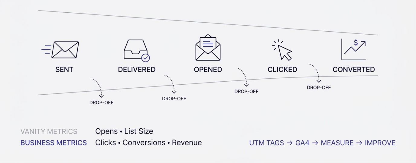
An email marketing metric is any number that describes what happened after you pressed send. Delivered, opened, clicked, bought, unsubscribed: each one measures a different moment in the subscriber’s journey. Looked at together, they show exactly where people drop off, which is the only way to know what to fix first instead of guessing.
What an Email Marketing Metric Actually Measures
An email marketing metric is a measurement of one specific behavior or outcome tied to an email campaign or automation. Delivery rate measures whether the message arrived. Click-through rate measures whether the message made someone act. Revenue per email measures whether that action turned into money. Each metric answers one narrow question, and the trouble starts when people use one answer for every question.
Think of a campaign as a pipe with several joints. Emails go in at one end: sent. Some leak at the first joint (bounces). More leak at the second (spam folder). A few more at the third (never opened). By the time the pipe reaches the checkout page, you are looking at maybe 1% of what you started with. If you only measure what comes out the far end, you never learn which joint is leaking.
That is why metrics work best as a chain rather than a pile. You read them left to right, in the order the subscriber experiences them. When the final number drops, you walk back up the chain until you find the first number that moved. Nine times out of ten, the problem is sitting earlier than you expected.
Vanity Numbers vs Numbers That Pay the Bills
A vanity metric makes you feel good without changing a decision. A money metric ties directly to revenue or to something that protects revenue later. Open rate is the classic vanity number. List size is another one. A list of 50,000 sounds impressive until you find out only 4,000 of those people have clicked anything in the last year.
Look at what actually happens in a real inbox. Someone opens your email on their phone while waiting for a bus, reads nothing, closes it. That is an open. Someone else never opens it but sees the subject line in a preview, goes to your website directly and buys. That is zero opens and one sale. The metric and the money are not even connected.
So the rule is simple. For every number on your dashboard, ask: if this moves 20%, what would I change? If the honest answer is nothing, it is decoration. Keep it in the report if the boss likes it, but do not steer by it. Steer by the numbers that make you do something different on Monday morning.
Setting Up Tracking Before You Send Anything
Bad data is worse than no data, and most bad data comes from skipped setup. Before the first campaign, add UTM parameters to every link: utm_source (say, newsletter), utm_medium (email), and utm_campaign (a clear name like diwali-sale-2026). Klaviyo can add these automatically, and Mailchimp has a Google Analytics tracking toggle in the campaign settings. Turn it on.
Next, check that Google Analytics 4 is installed correctly and that purchases or signups are marked as key events. If you are not sure how to do that, the basics of Google Analytics setup are worth an afternoon. Then, inside GA4, open Reports, then Acquisition, then Traffic acquisition, and look for the source and medium combination you created. If you see it, tracking works.
One more thing people skip: send yourself a test, click every link, and confirm the UTM tags show up in the browser address bar. Fifteen minutes of checking saves you from three months of reports where email revenue shows up as direct traffic. It happens more often than anyone admits, and it makes email look weaker than it really is.
Why Benchmarks Are Starting Points, Not Verdicts
Every marketer wants to know if a 21% open rate or a 2.4% click rate is good. Benchmarks give a rough answer, but they mix together newsletters from a Mumbai fashion label, a US SaaS company and a local gym. Your audience, list age, offer and sending frequency change what normal looks like. A benchmark tells you where to start looking, nothing more.
A better yardstick is your own history. Take the last 10 campaigns, calculate the average for each metric, and mark anything that falls more than 25% above or below. Those are the campaigns worth studying. The winners show you what to repeat. The losers show you what to stop doing. This beats any industry chart because the comparison is apples to apples.
That said, a few rough rules do hold up across most lists, and this guide gives them as working ranges: hard bounces under 2%, spam complaints under 0.1%, unsubscribes under 0.5% per send. Treat them as warning lights, not goals. If you sit well inside the range, stop worrying about that number and go improve the next one down the chain.
Deliverability and List Health: The Email Marketing Metric Group That Decides Who Sees Your Emails
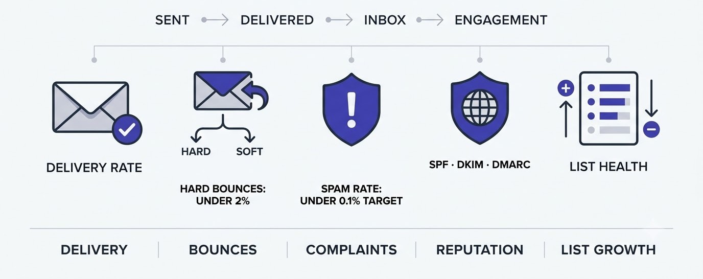
Before anyone can open, click or buy, the email has to land in a real inbox. This group of metrics covers that stage: delivery, bounces, complaints, reputation and list growth. Nobody gets excited about them, yet when they go wrong, every metric after them falls too, and fixing content will not help.
Delivery Rate
Delivery rate is the percentage of sent emails that the receiving mail server accepted. The formula is emails delivered divided by emails sent, times 100. If you send 10,000 emails and 9,820 are accepted, your delivery rate is 98.2%. Most healthy lists land between 97% and 99.5%, and anything below 95% deserves an investigation.
Here is the catch. Delivered does not mean inbox. A server can accept your email and then drop it into the spam folder or the Promotions tab without telling you. So delivery rate is a floor, not a finish line. It only tells you the message was not rejected at the door, which is useful but incomplete.
When delivery rate drops suddenly, check three things in order. First, did the list change? An old, unmailed segment is the usual culprit. Second, did someone edit the sending domain or authentication settings? Third, did you start sending from a new domain without warming it up? Warm-up means starting with small volumes to engaged subscribers and increasing slowly over a few weeks.
Bounce Rate: Hard Bounces vs Soft Bounces
Bounce rate is the share of emails that could not be delivered, calculated as bounced emails divided by emails sent, times 100. There are two kinds. A hard bounce is permanent: the address does not exist or the domain is dead. A soft bounce is temporary: a full mailbox, a server that is down, a message too large. Platforms treat them very differently.
Hard bounces should be removed immediately, and good platforms do it for you automatically. Keep them under 2% of any send. Above that, mailbox providers start reading you as someone who does not clean their list, which damages your sender reputation. Soft bounces get retried a few times. If the same address soft-bounces across three or four campaigns, treat it as dead and suppress it.
Where do high bounce rates come from? Mostly from bought or scraped lists, old lists nobody emailed for a year, and typos at signup (gmial.com is a surprisingly common one). A double opt-in form and a quick email verification tool at the signup stage cut most of this. Prevention is cheaper than cleaning.
Spam Complaint Rate
Spam complaint rate is the percentage of delivered emails that recipients marked as spam, calculated as complaints divided by delivered emails, times 100. A rate of 0.1% means one complaint per 1,000 emails. Google’s sender requirements, which started in February 2024, say bulk senders (5,000 or more messages a day to Gmail users) should stay under 0.3%, and Google recommends staying below 0.1%.
This is the number that can sink you. A 0.3% rate sounds tiny, but it is only three angry people in a thousand. Mailbox providers watch it closely because it is the one signal that directly comes from a human saying: I did not want this. You can check it for Gmail in Google Postmaster Tools, which is free, and most email platforms show complaint counts per campaign.
What drives complaints? Surprise, mostly. People who forgot they signed up, people who got a discount code and never wanted the newsletter, people who could not find the unsubscribe link and hit the spam button instead. Make unsubscribing painless. A visible link plus the one-click unsubscribe header that Gmail and Yahoo now require turns a would-be complaint into a clean exit.
Sender Reputation and Inbox Placement
Sender reputation is a score mailbox providers quietly keep about your domain and IP address, based on bounces, complaints, engagement and authentication. Inbox placement rate is the share of delivered emails that land in the main inbox instead of spam or Promotions. You cannot read either one directly in most platforms, which makes them frustrating to track.
Start with what you can see. Google Postmaster Tools shows domain reputation (High, Medium, Low, Bad) and spam rate for Gmail traffic. Microsoft offers Smart Network Data Services for Outlook traffic. For inbox placement, seed tests from tools like GlockApps or Litmus send your email to test accounts and report where it landed. Run one before big sales.
Authentication is the base layer. SPF, DKIM and DMARC are three DNS records that prove an email really came from you. Without all three, large inbox providers treat you with suspicion, and since 2024 they are effectively required for bulk senders. If your list tools show a setup warning, fix it today. Everything else on this page depends on it. For wider reading on list building and deliverability, the Email Marketing hub has more.
List Growth Rate and List Churn
List growth rate shows whether your audience is actually getting bigger once you subtract the people who leave. Formula: new subscribers minus unsubscribes minus complaints and bounces, divided by total list size, times 100. Take a list of 10,000 with 600 new signups, 150 unsubscribes and 40 bounces and complaints. That is 410 net, or 4.1% growth for the period.
Total list size alone is a trap. A list that gains 1,000 and loses 900 looks like it is growing and is really churning. Track gross adds and losses separately for a month. Sudden churn spikes usually trace back to one specific email, a frequency jump, or a signup source that attracted the wrong people, like a giveaway that brought prize hunters.
Healthy lists also get pruned. If a subscriber has not opened or clicked anything in 6 to 12 months, send a short win-back series, and if that fails, remove them. Yes, your list gets smaller. Your rates go up, your complaint risk goes down, and your platform bill drops too. A smaller list of people who care beats a bigger list of ghosts every single time.
Engagement Email Marketing Metric Types: Opens, Clicks and What They Really Tell You
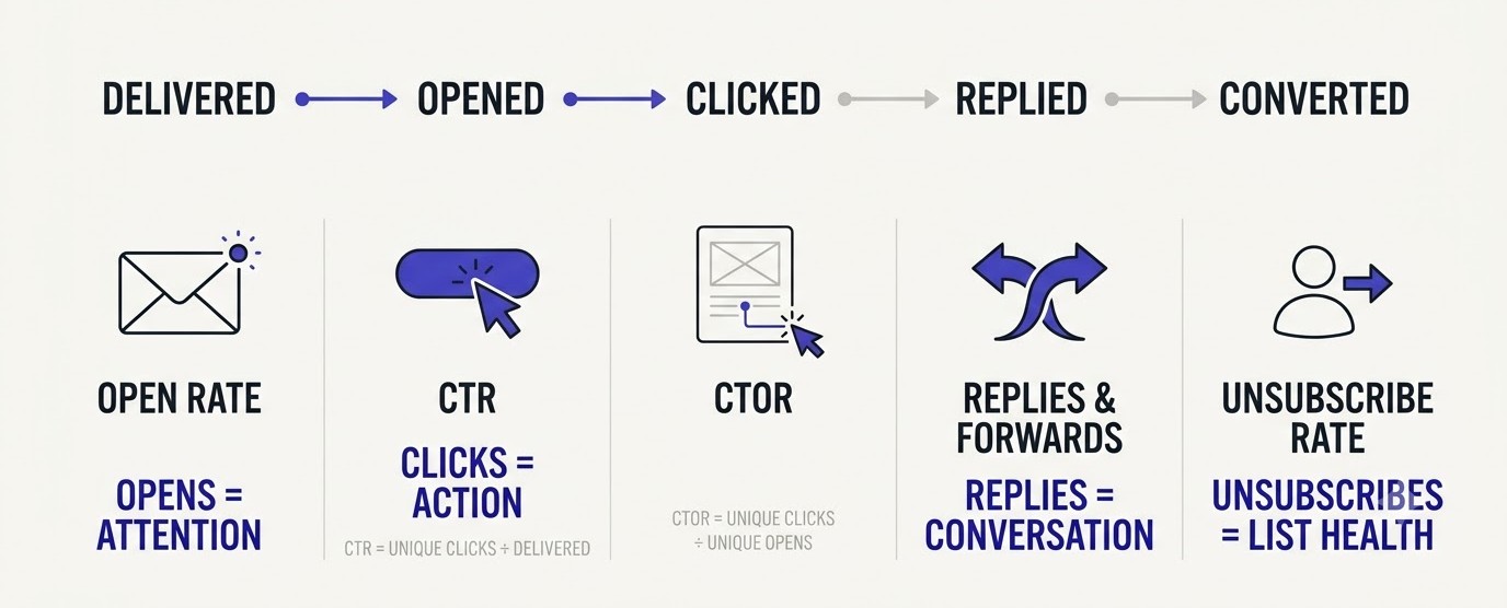
Once the email lands, engagement metrics show how people react. This is where most beginners spend all their time, and where most misreadings happen. Opens, clicks, click-to-open rate and unsubscribes each describe a slightly different kind of attention, and none of them should be read alone.
Open Rate After Apple Mail Privacy Protection
Open rate is the percentage of delivered emails that recorded an open. Formula: unique opens divided by delivered emails, times 100. Email tools measure it with a tiny invisible image (a tracking pixel) that loads when the message is displayed. That worked fine for years, until Apple Mail Privacy Protection arrived with iOS 15 in September 2021.
With that feature on, Apple preloads images for the user, which means the pixel fires whether or not a human ever looked at the email. So a share of your opens are now machine opens. If a big chunk of your list uses the Apple Mail app (common in India and the US, where iPhones are everywhere), your open rate is inflated by an amount you cannot see precisely. Some platforms let you filter these opens out, which is worth switching on.
So is open rate dead? Nope. It is still useful for one thing: comparing subject lines inside the same list in the same week. Both versions suffer from the same inflation, so the difference between them still means something. Just stop reporting it as proof that people read your emails, and stop making big decisions with it.
Click-Through Rate
Click-through rate (CTR) is the percentage of delivered emails that produced at least one click. Formula: unique clicks divided by delivered emails, times 100. If 11,800 emails are delivered and 354 people click, CTR is 3%. Rough working range for most lists is 2% to 5%, though a tight, well-targeted list can run far higher.
CTR matters because a click is a deliberate act. Nobody clicks by accident on a preloaded pixel. That makes it the most honest engagement signal you have, and it is why serious teams moved their attention from opens to clicks after 2021. A rising CTR means your content, offer and call to action match what the audience wants.
To improve it, look at the email itself. Is there one clear button, or six competing links? Does the button text say what happens next (Get the 15% code) instead of something vague (Click here)? Is the button visible without scrolling on a phone? Most email is read on mobile, so test every layout in a tool like Litmus or the preview feature in your platform before sending.
Click-to-Open Rate
Click-to-open rate (CTOR) compares clicks to opens: unique clicks divided by unique opens, times 100. It answers a slightly different question than CTR. Of the people who opened, how many found the content good enough to act on? A subject line decides the open. The body of the email decides the click. CTOR isolates the body.
Say two campaigns both have a 3% CTR. Campaign A had 20% opens, so its CTOR is 15%. Campaign B had 40% opens, so its CTOR is 7.5%. Same CTR, very different stories. Campaign A had a quiet subject line and a strong email. Campaign B had a loud subject line and a weak email.
There is a catch, though. Because opens are inflated by Apple’s privacy feature, CTOR is now lower and noisier than it used to be, so old benchmarks no longer apply. Use it as a trend inside your own account, comparing this quarter with last quarter, instead of comparing against a number someone published in 2019.
Unsubscribe Rate
Unsubscribe rate is the percentage of delivered emails that led to someone leaving your list. Formula: unsubscribes divided by delivered emails, times 100. A rate under 0.5% per campaign is normal for most senders. Many newsletters sit closer to 0.1% to 0.2%.
Here is a take that surprises people: some unsubscribes are good. Someone who was never going to buy and clicks unsubscribe is doing you a favor. They stop dragging down your engagement rates, and they stop being a complaint risk. The number to worry about is a sudden jump, such as 1.5% on one campaign when you usually see 0.2%.
When you spot a spike, open that email and read it like a stranger. Was it the first message after a long silence? Did frequency jump from weekly to daily? Was the offer aimed at a segment but sent to everybody? Fix the cause, not the symptom. And always put a short, honest exit page behind the unsubscribe link, with an option to switch to fewer emails. It saves a surprising number of subscribers.
Forwards, Replies and Reading Time
Some of the best engagement signals never show up in the main report. Replies are one. A subscriber who writes back to your email is telling Gmail and Outlook that this is a real conversation, and that helps future inbox placement. A founder-style plain text email asking one simple question often pulls more replies than a polished design.
Forwards and shares are another. Most platforms track forward clicks, or you can add a Forward to a friend link. Someone who passes your email along is vouching for you, and that new reader is a lead you did not pay for. Newsletter operators track this closely because referrals are the cheapest growth they have.
Reading time or engagement time, which Klaviyo and some newsletter platforms estimate, tells you whether people skimmed or stayed. It is rough, since it also depends on pixel loading, but a pattern across several sends is still informative. If long emails get short reading times, cut them. If short emails get a lot of replies, write more of them.
Revenue and Conversion: The Email Marketing Metric KPIs That Justify the Budget
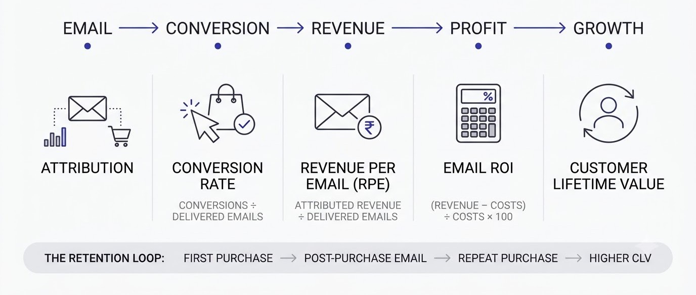
Engagement is nice. Revenue is what keeps the program alive when someone senior asks why the company pays for an email platform. This section covers the numbers that connect an email to a rupee, a dollar or a signup, and the traps that make email look weaker than it is.
Conversion Rate
Conversion rate is the percentage of recipients who complete the goal you set for the email, like a purchase, a registration or a download. Formula: conversions divided by delivered emails, times 100. Some teams divide by clicks instead, which gives the landing page conversion rate. Both are useful, but name which one you are using in every report so nobody mixes them up.
Define the goal before you send. A sale email has one conversion: purchase. A webinar email might have two: registration and attendance. A product education email might have none directly, only a later signal like an upgrade. If you never decide what counts, the report will be a pile of numbers with no verdict.
When click rate is healthy but conversion rate is poor, the problem sits after the email. Check the landing page: does it match the promise in the subject line? Is the discount code applied automatically? Does the page load in under three seconds on a mid-range phone? A broken handoff between email and page wastes the best subject line ever written.
Revenue Per Email and Revenue Per Recipient
Revenue per email (RPE) is total attributed revenue divided by emails delivered. It is the cleanest way to compare campaigns of different sizes. If a campaign to 11,800 delivered emails brings in ₹1,18,000, revenue per email is ₹10. A flash sale to a 2,000-person segment that earns ₹30,000 has an RPE of ₹15, so it quietly beat the bigger send.
A close cousin is revenue per recipient or per subscriber over a time window, such as 30 days. This one smooths out timing quirks and answers a sharper question: how much is one name on my list worth each month? Once you know that figure, decisions get easier. If a new subscriber is worth ₹40 a month, you know how much you can pay to acquire one.
Use RPE to settle arguments. Someone wants to send three emails a week instead of one? Test it, then compare total revenue per subscriber, not per email. The first number will fall because each email gets less attention. The second tells you whether the extra volume paid off or just burned goodwill. Often it does the latter.
Email Marketing ROI
Return on investment is how much you earned compared with what you spent. Formula: (revenue minus cost) divided by cost, times 100. Suppose a campaign brings in ₹1,18,000, and costs add up to ₹21,000: the platform share, a freelance designer, and the discount you gave away. That is (1,18,000 minus 21,000) divided by 21,000, or about 462% ROI.
Count costs honestly. Include the tool subscription, the time of whoever wrote and designed the email (even if that is you), and any discounts. Leaving out discounts is a common mistake, and it makes email look far better than it is. If you want to run the numbers faster, the free marketing tools section on this site has calculators that help.
One warning. ROI looks spectacular for small senders because their costs are small, and that is fine. The honest question is not whether email beats paid ads on paper but whether the next hour you spend on email will earn more than the next hour on anything else. Track ROI by campaign type: welcome series, promotions, newsletters, abandoned cart. You will find that two types carry most of the profit.
Customer Lifetime Value and Repeat Purchase Rate
Customer lifetime value (CLV) is the total profit you expect from a customer over the whole relationship. A simple version: average order value times purchases per year times average years retained. If someone spends ₹1,500 per order, buys three times a year and stays two years, CLV is ₹9,000. Email’s biggest job is raising the number of repeat purchases.
Compare customers who joined your email list with those who did not. In Klaviyo or Shopify reports, build two segments and look at orders per customer after 90 days. If email subscribers buy 1.8 times and non-subscribers 1.2 times, email is doing real work, even if single campaigns look modest. This is the argument that wins budget meetings.
Repeat purchase rate, the share of customers who buy a second time, is the companion number. It tells you whether post-purchase emails (thank you, how to use it, review request, reorder reminder) are doing their job. A low rate after a month usually points to a weak post-purchase flow, not a weak product.
Attribution Windows and Why Email Gets Undercounted
Attribution is the rule that decides which channel gets credit for a sale. Most email platforms credit an email if the customer clicked within a set window, commonly 5 days for campaigns and sometimes up to 5 days for flows, and some also count opens. Google Analytics 4 uses its own rules, so the two systems rarely match. Expect differences and write down which one you use.
Why does email get undercounted? Because it often assists rather than closes. A subscriber reads your Thursday email, does nothing, then searches your brand name on Saturday and buys through Google. GA4 might credit organic search. Meanwhile, the email platform may credit you only if there was a click. Neither system sees the full story.
The practical fix is to track both sources and look at trends. In GA4, check the Conversion paths report to see how often email appears earlier in the journey. In your platform, compare revenue in weeks you sent with weeks you did not. If sales dip in quiet weeks, email is doing more than any last-click report admits.
How to Build an Email Marketing Metric Dashboard and Review Routine You Will Actually Use
Knowing the formulas is half the job. The other half is turning them into a habit. A dashboard nobody opens is just a nicer-looking pile of numbers, so this section focuses on keeping the system small, repeatable and tied to decisions.
Pick Five or Six KPIs Per Goal
The temptation is to track everything, because the platform makes it easy. Resist it. Start with the goal of the email program and choose five or six numbers that match. A store focused on sales might watch delivery rate, click-through rate, conversion rate, revenue per email, unsubscribe rate and spam complaints. A newsletter focused on growth might swap in list growth rate, forwards and replies.
Write the list on one page and put a target next to each, based on your own last 10 campaigns instead of someone else’s benchmark. When a number moves outside the target range, it triggers a specific check. Spam complaints over 0.1%? Review the last send and pause promotional blasts to cold segments until it recovers.
That is all a dashboard is: a short list, a target, and a trigger. You can build it in Google Sheets with data pulled from your email platform each week, or use the built-in dashboard in Klaviyo, Brevo or HubSpot. A spreadsheet is slower but forces you to look at the numbers, which is where learning happens.
A Weekly, Monthly and Quarterly Rhythm
Different metrics move at different speeds, so review them at different intervals. Weekly, glance at deliverability and engagement for the campaigns you sent: delivery rate, bounces, complaints, CTR. This takes ten minutes and catches problems early. If a bad send goes out on Tuesday, you want to know on Wednesday, not at month end.
Monthly, look at revenue and list health: revenue per email, conversion rate, list growth, churn and the unsubscribe trend. Compare this month with the previous one and with the same month last year if you have it. Seasonal businesses like gifting and fashion need that year-on-year view, otherwise a normal post-festival dip looks like a crisis.
Quarterly, step back. Calculate customer lifetime value for email subscribers against non-subscribers, check the revenue split between campaigns and automated flows, and prune inactive subscribers. Quarterly reviews are also when you decide what to stop doing. If a weekly newsletter has produced tiny revenue and no replies for three months, either rework it or retire it.
Reading A/B Test Results Without Fooling Yourself
A/B testing means sending two versions of an email to small slices of your list and seeing which performs better. The mistake most beginners make is declaring a winner too early. If version A has 22 clicks and version B has 26, that is noise, not a result. Small differences on small samples flip from one day to the next.
A practical rule: test one thing at a time (subject line, button text, send time), use at least a few thousand recipients per version if you can, and wait for the metric that matches the test. Subject line tests should be judged on clicks or conversions rather than opens, given the inflation problem. Most platforms show a confidence level; aim for 95% before acting.
Also keep a testing log in a simple sheet: date, what you tested, the result, what you learned. After six months, patterns appear. Maybe questions in subject lines beat statements, or Tuesday mornings beat Friday evenings for your audience. That log becomes your own private benchmark, and no industry report can give you that.
Common Mistakes When Tracking Email Metrics
The first is chasing open rate. It is easy to see and easy to move with a clickbait subject line, and it tells you very little about money. The second is ignoring segments. An average click rate of 2.5% might hide a 6% rate among recent buyers and 0.3% among people who joined a year ago. Segment first, then judge.
The third is mixing up time windows. Comparing a campaign’s first 24 hours against another’s full 7 days gives a false picture. Pick a standard window, such as 48 hours for engagement and 5 days for revenue, and stick with it. The fourth is trusting a single source. Compare your email platform’s numbers with GA4 and with your store’s own order data. Gaps are normal, big gaps are a bug.
And the last: reporting without action. Every review should end with one change to try next week. That is how a metric turns into improvement. If you want a structured path through email, analytics and the rest of the channel mix, the Alpha Marketer Foundation Program covers it step by step.
A Worked Example: A 12,000-Subscriber Store
Take a small online store with 12,000 subscribers sending four campaigns a month plus automated welcome and abandoned cart flows. Last month: delivery rate 98.6%, hard bounces 0.7%, spam complaints 0.04%, CTR 2.9%, unsubscribe rate 0.3%, conversion rate 0.5% of delivered emails, and revenue per email delivered of ₹7.50 on campaigns.
Read it left to right. Delivery and complaints are healthy, so reputation is fine. CTR is decent. The weak link is conversion: people click, then leave. The owner checks the landing pages and finds the discount code does not apply automatically on mobile. Fixing that single issue lifts conversion from 0.5% to 0.7%, which on 47,000 delivered emails is roughly 94 extra orders.
Notice what the owner did not do. No subject line rewrite, no new template, no panic over opens. The chain pointed to one broken joint, and fixing it was worth more than a month of fiddling elsewhere. That is the whole point of measuring in layers: the numbers tell you where to look, and you stop guessing.
Conclusion
Every email marketing metric tells part of a story, and none of them tells all of it. Delivery and complaints say whether you are allowed into the inbox. Clicks say whether the message earned attention. Revenue per email and lifetime value say whether any of it was worth doing. Read them in that order and the picture gets clear fast.
The next step is small. Open your last campaign report today, write down five numbers (delivery rate, spam complaint rate, CTR, unsubscribe rate, revenue per email), and set a target for each from your own history. Then do the same after the next send. For more guides like this one, browse the Learn hub and keep building from there.
Frequently Asked Questions
What are the most important email marketing metrics to track?
Start with delivery rate, spam complaint rate, click-through rate, unsubscribe rate, conversion rate and revenue per email. Together they cover whether emails arrive, whether people engage, whether they leave, and whether money comes in. Open rate and list size can be tracked too, but they should not drive decisions on their own.
What is a good open rate for email marketing?
There is no single good number, because open rates vary by industry, list age and audience. Since Apple Mail Privacy Protection launched in 2021, reported opens are inflated, so old benchmarks no longer apply. Compare against your own recent campaigns, and use open rate mainly to test subject lines against each other.
What is a good click-through rate for email?
Most lists land between 2% and 5% click-through rate, though a well-segmented list can go higher. Newsletters with several links often show lower per-link rates than single-offer promotions. Judge your number against your own average for the last 10 campaigns, then look for what the best performers had in common.
What is the difference between click-through rate and click-to-open rate?
Click-through rate divides clicks by delivered emails, so it measures the whole audience. Click-to-open rate divides clicks by opens, so it measures how engaging the content is among people who actually opened. CTR shows overall performance, while CTOR helps separate subject line quality from email body quality.
How do you calculate email marketing ROI?
Subtract total cost from revenue, divide by total cost, then multiply by 100. For example, ₹1,18,000 revenue against ₹21,000 cost gives about 462%. Include the platform fee, design and writing time, and any discounts offered. Leaving out discounts is the most common error and makes results look better than they are.
What is a healthy bounce rate for email campaigns?
Keep hard bounces under 2% of each send, and ideally under 1%. Hard bounces come from invalid addresses and should be removed automatically. Soft bounces are temporary, like a full inbox, and get retried. If bounces climb, check for old list segments, typos at signup, or purchased lists.
What spam complaint rate is too high?
Google’s bulk sender requirements say to stay under 0.3%, and Google recommends keeping it below 0.1%. Above 0.3%, inbox placement can fall quickly. Check Google Postmaster Tools for Gmail, make unsubscribing easy, and send only to people who asked for your emails.
Is open rate still a reliable email marketing metric?
Not on its own. Apple Mail Privacy Protection preloads tracking pixels, which records opens even when no one reads the email. It still works as a rough comparison inside one list, such as an A/B subject line test, but it should not be used to claim real readership or to measure revenue impact.
How often should you review email marketing metrics?
Review deliverability and engagement weekly, revenue and list health monthly, and lifetime value and list pruning quarterly. Weekly checks catch problems like rising complaints early. Monthly checks show whether the program earns money. Quarterly reviews help decide what to start, change or stop.
How do you calculate list growth rate?
Take new subscribers, subtract unsubscribes, bounces and complaints, divide by total list size at the start of the period, then multiply by 100. A list of 10,000 that gains 600 and loses 190 has 410 net new contacts, so growth is 4.1%. Track gross adds and losses separately to spot churn.
What is a good email marketing conversion rate?
Conversion rate depends heavily on the offer, price and audience, so ranges are wide. Many ecommerce campaigns see well under 1% of delivered emails convert, while targeted flows like abandoned cart often convert much higher. Measure against your own history and clearly state whether you divide by delivered emails or by clicks.
Which tools can track an email marketing metric accurately?
Mailchimp, Klaviyo, Brevo and HubSpot all report core metrics such as delivery, clicks, unsubscribes and attributed revenue. Pair them with Google Analytics 4 for site behavior, Google Postmaster Tools for Gmail reputation, and a seed-testing tool such as GlockApps or Litmus for inbox placement. No single tool shows everything.
How can you improve email deliverability?
Authenticate your domain with SPF, DKIM and DMARC, warm up new sending domains slowly, clean your list regularly and remove hard bounces. Send to engaged subscribers first, keep complaint rates low, and include a clear unsubscribe link. Consistent sending patterns also help mailbox providers trust your domain over time.