

Picture this. Your designer sends a banner for the Diwali sale, and the blue is slightly off from the one on your website. The social media intern builds a Canva post using a font from a free pack. Someone in sales pastes your logo into a PowerPoint and stretches it sideways so it fits. A local printer runs your brochures and the logo comes out with a white box behind it. Nobody did anything wild. Everybody just guessed, because nothing told them what “right” looks like.
That gap is exactly what a style guide fills. If you have been wondering how to create a brand style guide without hiring an agency or losing two months of your life, this post walks through the whole thing, one step at a time. No fluff about “brand journeys”. Just the decisions you need to make, the tools to make them in, and the mistakes that quietly wreck brands.
Here’s what most guides get wrong: they treat it like a design exercise. Pick pretty colors, drop in the logo, export a PDF, done. Nope. A style guide that sits in a folder called “Brand_Final_v7” and never gets opened is worse than having none, because it gives you the feeling of being organized. A good one is short enough to read on a phone, specific enough to settle arguments, and easy enough to find that people use it without being nagged.
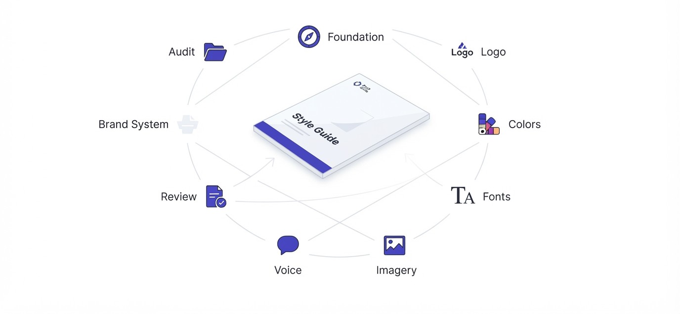
The steps below are the ones that hold up in real work. You audit what you already have, set the foundation, lock the logo rules, choose colors, pick fonts, decide how images should look, write down how the brand talks, package it all in a format people can actually use, and then keep it alive. Each step comes with named tools like Canva Brand Kit, Figma, Coolors and the WebAIM contrast checker, along with real numbers like hex codes, pixel sizes and contrast ratios.
Whether you are a freelancer, a shop owner, or the first marketing hire at a startup, a small brand can finish this in a weekend. Bigger teams need longer, but the order stays the same. Grab a coffee, open a blank doc, and let’s build it.
TL;DR
- A brand style guide is a short rulebook that tells anyone how your logo, colors, fonts, images and words should look and sound.
- Start by auditing everything already out in the world, because you will find the real inconsistencies there, not in your head.
- Lock the basics first: two or three colors, two fonts, one logo with clear space rules, and a voice described in behaviors instead of adjectives.
- Every rule needs an example of right and wrong, since people copy examples far more than they read paragraphs.
- Put the guide in a place people already visit (Canva Brand Kit, Notion, Figma, a shared link) and review it twice a year.
What You Will Learn in This Guide
Before we get into the steps, here is the map. Each section builds on the one before it, so you can follow the whole thing in order or jump to the part you are stuck on. Nothing here needs design school or expensive software. You just need a few hours, some honest opinions about your own brand, and a willingness to cut things.
- What a brand style guide really is, and how it differs from brand guidelines and a brand book
- How to audit your existing logo, colors, fonts, posts and documents in one afternoon
- How to write a brand foundation (purpose, audience, personality) that actually guides decisions
- How to set logo rules including versions, clear space, minimum size and misuse examples
- How to choose a color palette with hex, RGB and CMYK codes that passes accessibility checks
- How to pick and pair fonts, set a type hierarchy and plan for fallback fonts
- How to define imagery, icon and graphic rules so every post looks like it came from the same brand
- How to describe your brand voice and tone with real before and after sentences
- How to package the guide in Canva, Figma, Notion or PDF and roll it out so people use it
- The common mistakes that make style guides useless, and how to avoid every one of them
How to Create a Brand Style Guide: What It Is and Why It Matters
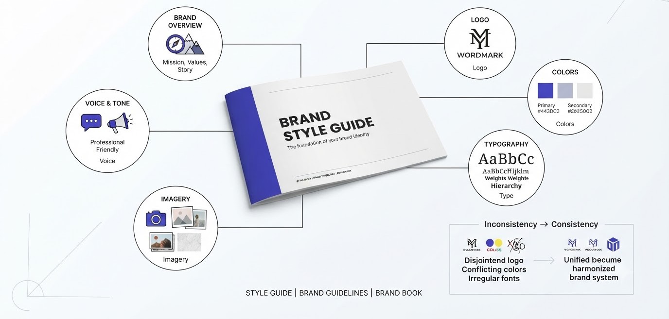
A brand style guide is a document that spells out how your brand looks and sounds in every place it shows up. It covers the logo, colors, typography, imagery and tone of voice. Before building one, it helps to be clear on what it is, what it is not, and what happens to brands that keep skipping it.
What a Brand Style Guide Actually Contains
Think of it as the answer sheet for every small design or writing decision your team makes. Which blue? Which font for the headline? Can the logo sit on a photo? Should the caption sound playful or serious? A solid guide answers these in plain language with visual examples, so nobody has to message the founder at 9 pm asking if a shade is okay.
Most guides include six parts: a short brand overview, logo usage, color palette, typography, imagery and graphics, and voice and tone. Bigger companies add layout grids, motion rules, packaging and email templates. For a small business, those six parts are plenty. If you cover them clearly on ten to fifteen pages, you are ahead of most brands out there.
Brand Style Guide vs Brand Guidelines vs Brand Book
These three terms get thrown around like they are the same thing. They overlap, but the scope is different. A style guide is the practical, visual and verbal rulebook. Brand guidelines is often the broader umbrella, which can include strategy, positioning and rules for partners. A brand book is usually the polished, storytelling version, sometimes printed, sometimes used to impress investors.
Here is a simple way to remember it. The style guide is what your designer opens on a Tuesday. The brand book is what the CEO hands to a new hire on day one. Plenty of teams use the words interchangeably, and honestly that is fine. What matters is that the document exists and answers real questions.
What Happens to Brands That Skip It
Nothing dramatic happens on day one. That’s the trap. The damage builds slowly. A new designer joins and rebuilds the presentation template from scratch. A freelancer picks a slightly different orange. Six months later your Instagram, website and packaging look like three cousins who barely talk to each other.
Inconsistency also costs money. Every time someone asks “which logo file is the right one?” or a designer redoes a banner because the color was off, hours disappear. Multiply that by a team of ten over a year and you are paying real salaries to solve a problem a ten-page document would have prevented. Skipping the guide is not saving time, it is borrowing it at a terrible interest rate.
Step 1: Audit What You Already Have
The first step in how to create a brand style guide is not designing anything. It is looking at what already exists. Most brands have more assets than they think, scattered across drives, phones and old email threads. An audit shows you what is working, what is a mess, and what you can safely keep.
Collect Every Asset in One Place
Open a folder and call it “Brand Audit”. Now pull in everything: logo files, website screenshots, Instagram posts from the last three months, pitch decks, invoices, business cards, packaging photos, email signatures, ad creatives, even the WhatsApp catalog. Screenshot anything you cannot download. The goal is to see the whole brand at once, like laying every outfit on the bed before cleaning a wardrobe.
This step is boring and it is the most useful one. You will find at least three versions of your logo, and likely a couple you forgot existed. Put everything into a single Google Drive folder or a Figma page, and label each item with where it lives. If you can, use a Miro or Figma board so you can zoom out and see patterns.
Spot the Inconsistencies
Now look for repeats and clashes. How many different blues are there? How many fonts? Is the logo ever stretched, recolored, or placed on busy photos? Write a simple tally. A typical small brand might turn up five shades of the “same” blue and four typefaces without anyone deciding on any of them.
Use the eyedropper tool in Canva, Figma or Photoshop to grab actual color codes from your assets instead of trusting your memory. For fonts, Chrome extensions like WhatFont show exactly what a website uses. The point is not to feel bad. It is to collect proof, because proof makes decisions easy later. When you see nine shades of green on the table, picking one stops being a debate.
Ask the People Who Use Your Brand
Your audit is not complete until you talk to the humans touching the brand every day. Ask the social media person where they hunt for the logo. Ask sales what they do when a slide template does not fit. Ask the designer what rules they keep in their head that nobody else knows. Ten minutes each is enough.
You are looking for friction. If three people say “I never know which file to use”, that becomes a rule and a folder. If nobody knows the approved font, that becomes a typography page. Write down what they say, close to word for word. Those complaints turn into the sections of your guide, so the guide solves problems people really have.
Step 2: Define Your Brand Foundation
Colors and fonts feel like the fun part, but they need something to hang on. Your brand foundation is a short page explaining who you are, who you serve and how you want to feel. Get this down first and every design choice afterward gets easier, because you can check it against something real.
Purpose, Mission and Values in Plain Words
Skip the paragraph that sounds like it was written by a committee. Write one sentence on why the business exists and one on what you promise customers. For example, imagine a small bakery in Pune called Crumb & Co. Its purpose might be “to make fresh bread feel like an everyday thing, not a weekend treat.” Simple. You can picture the shop from that line.
Values work the same way. Pick three at most, and attach a behavior to each one. “Honest” means nothing by itself. “We print the real ingredient list on every box” is a value someone can follow. When a designer or writer is stuck, a value with a behavior gives them something to lean on, and that saves everyone a meeting.
Know Your Audience Before You Pick a Single Color
A style guide for everyone is a style guide for nobody. Describe your main audience in a few lines: age range, where they spend time online, what they care about, what annoys them. Crumb & Co. might say “25 to 40, works in IT, orders on Swiggy, hates overly fancy cafes, loves knowing where ingredients come from.”
That short profile does real work. It tells you a warm, earthy palette will beat a neon one. It tells you captions should be friendly, not stiff. If you already have customer data, pull from it: Instagram Insights shows age and location, Google Analytics shows device and city, and even ten customer chats can reveal how people describe your product in their own words. For more on the strategy side, the digital marketing basics hub covers how audience and positioning connect.
Positioning and Brand Personality
Positioning is how you want to be seen compared to alternatives. Personality is how the brand behaves once people meet it. Write both in a few lines. “The neighborhood bakery that treats bread seriously but never takes itself too seriously” covers both at once, and it gives the design and writing teams a clear direction to move in.
A trick that works well: pick three personality traits and add a “but not” to each. Friendly, but not silly. Confident, but not pushy. Simple, but not boring. The “but not” part is where the magic sits, since it draws the fence. Without it, traits like “friendly” stay so loose that a meme-heavy Instagram and a formal invoice can both claim to fit.
Step 3: Set Clear Logo Rules
The logo is the most copied, stretched and abused asset a brand owns. Rules here prevent the ugliest mistakes. This part of learning how to create a brand style guide is mostly about giving people the right files and telling them plainly what they may and may not do with them.
Logo Versions and File Formats
Most brands need more than one logo file. A primary logo (usually horizontal), a stacked version for square spaces, an icon or mark for tiny spaces like a favicon or profile picture, and a one-color version for stamps, embroidery or fax-era print jobs. Each should come in a light and dark background variant.
File formats matter as well. Give people SVG or PDF vectors for anything that scales, PNG with a transparent background for web and slides, and JPG only where transparency does not matter. Name the files clearly, like crumbco-logo-horizontal-color.svg, so nobody guesses. Put them in a shared folder linked from the guide. If people have to email you for the logo, you have already lost.
Clear Space and Minimum Size
Clear space is the empty area around the logo that nothing else may enter. A common method is to use a part of the logo itself as a measuring unit, like the height of the letter “C”, and keep that distance on all four sides. Draw it in the guide with a dotted box so nobody has to interpret words.
Minimum size is the smallest the logo can appear before details disappear. Test it. Print the logo at different widths, or shrink it on screen. Many brands land around 24 pixels tall for digital and roughly 20 mm wide for print, but your logo may need more if it has fine lines. Write the numbers down. “Do not make it too small” is not a rule, “not under 120 px wide on screen” is.
Logo Misuse Examples
This is the page people actually remember. Show the logo being stretched, rotated, recolored, given a drop shadow, placed on a busy photo, or squished beside another logo. Put a red cross on each and one short line explaining why. It takes an hour to make and prevents years of small disasters.
Be honest about what you see in your audit. If your team keeps placing the logo on low-contrast photos, show that exact case. Real mistakes from your own brand teach faster than generic ones from a template. Also add a tiny line about who to ask for special cases, like co-branded posters with partners, so people have a next step instead of improvising.
Step 4: Choose a Color Palette That Holds Up
Color is the fastest way people recognize a brand, often before they read a word. The mistake is picking colors because they look nice on your screen. Good palettes are limited, tested for readability and documented with exact codes, so a printer in another city can match them.
Primary, Secondary and Accent Colors
Keep it tight. Two primary colors, two or three secondary colors, and one accent for buttons or highlights. That is enough for almost every small brand. A well-known rule of thumb is 60-30-10: roughly 60 percent dominant color, 30 percent secondary, and 10 percent accent. It is not law, but it stops designs from turning into confetti.
Open Coolors or Adobe Color and play around with combinations, but start from your brand personality, not from a trend. Warm, earthy tones suit a bakery. Deep navy suits a fintech app. Give each color a plain name too, like “Toasted Crust” or “Flour White”, since names make it easier for teams to talk about them. Then note where each color should be used and where it should not.
HEX, RGB, CMYK and Pantone Codes
Every color needs codes for each medium. HEX (like #C2703D) and RGB are for screens. CMYK is for standard printing. Pantone is for exact matching on packaging, signage or merchandise. A color that looks perfect on your laptop can print dull, because screens glow and paper reflects, so always test a printed proof before ordering 5,000 boxes.
List the codes in a small table under each swatch. Use Canva’s Brand Kit or Figma’s color styles to store them so designers pick from the palette instead of eyeballing. For deeper learning on logos, palettes and visual hierarchy, the graphic design tutorials collection is a good next stop. Consistent codes are boring, and boring is exactly what you want here.
Accessibility and Contrast Checks
Pretty is useless if people cannot read it. The Web Content Accessibility Guidelines (WCAG) set a minimum contrast ratio of 4.5 to 1 for normal text and 3 to 1 for large text. Light grey text on a white background often fails, and pale yellow on white fails badly. Plenty of brands find this out only after customers complain.
Use the free WebAIM Contrast Checker: paste in the foreground and background hex codes and it tells you pass or fail. Run every text and background pairing you plan to use, then list the approved pairs in the guide. Something like “Toasted Crust on Flour White: passes AA”. It takes fifteen minutes and makes your brand readable for more people, including anyone with low vision or anyone squinting at a phone in bright sunlight.
Step 5: Pick Fonts and Set a Type Hierarchy
Fonts do a lot of quiet work. They set the mood before anyone reads a sentence, and they decide whether a page feels easy or exhausting. This step is about choosing a small set of typefaces, deciding where each one goes, and writing the sizes down so nobody wings it.
Choosing Your Brand Fonts
Two fonts is the sweet spot. One for headlines, one for body text. Some brands use a single family with different weights, which is even safer. A common pairing is a serif headline with a clean sans-serif body, or the reverse. What matters is contrast between the two, not decoration. If both fonts fight for attention, your layouts will feel noisy.
Google Fonts is a good place to start because it is free for commercial use and works on the web without extra licensing headaches. Try Playfair Display with Inter, or Poppins with Lora, and see how they sit together on a mock-up. Avoid picking a font just because it looks fancy in a logo preview. Check that it has enough weights (regular, medium, bold) and supports every language you need, including Hindi or Odia if your audience reads them.
Building a Type Hierarchy With Real Sizes
Hierarchy tells the eye where to look first. In your guide, list each level: H1, H2, H3, body text, captions and button labels, with font, weight, size and line height. For web, body text usually sits around 16 px with a line height of 1.5, and an H1 might be 40 to 48 px. Write the numbers so nobody guesses.
Show an actual sample, not only a table. A small mock blog page or a sample Instagram carousel slide, with each level labeled, helps people see how the pieces fit together. Also note rules around letter case, like whether headlines use sentence case or ALL CAPS. Mixed-case headlines are easier to read for long titles. Pick one and stick with it, because switching between them makes a brand feel unsure of itself.
Fallback Fonts and Licensing
Here is a problem that catches people out. You pick a beautiful paid font, then your teammate opens the PowerPoint on a laptop without it, and everything turns into Arial. Fix this by naming a fallback font for situations where your brand font is not available, like Calibri or Arial for internal documents and email.
Licensing is the other trap. Fonts bought for print are not always licensed for web use, and desktop licenses often do not cover apps or embedded PDFs. Check the license before you build your brand around a font, since retrofitting is painful and sometimes expensive. If budget is tight, stick to open-source families on Google Fonts, which usually have simple, clear licenses and plenty of quality options.
Step 6: Set Rules for Images, Icons and Graphics
Once color and type are locked, visuals are next. Photos, icons and illustrations are where brands drift the fastest, since everyone has a different eye. This step gives your team a shared taste, described in words and examples, so a post from March still looks related to one from October.
Photography and Image Style
Describe the photos you want in plain terms: natural light or studio? Close-up or wide? People smiling at the camera or caught mid-action? Crumb & Co. might say “warm natural light, hands in the frame, flour dust, no stock photos of people laughing at salads.” That last bit is gold, because it tells people what to avoid.
Add a short mood board of five to eight approved photos and a matching set of rejected ones. Also cover practical things: aspect ratios for Instagram (4:5 for feed posts is common), cropping rules, whether filters are allowed, and how much text can sit on an image. If you use stock, name the sources you trust, like Unsplash or Pexels, and set a rule that nobody picks the first search result.
Icons, Illustrations and Graphic Elements
If your brand uses icons, choose one style and stay in it. Line icons with a 2 px stroke and rounded ends, or filled icons in brand colors. Mixing the two makes any page look patched together. Pick an icon library like Phosphor, Feather or Material Symbols and list which one is approved, so people stop pulling random icons from a search.
The same goes for patterns, shapes, borders and illustrations. Show what they look like, where they are allowed, and how big they should be relative to text. A brand that uses rounded corners on buttons but sharp corners on cards will feel a bit off without anyone knowing why. Write down corner radius, shadow use and border weight, even if it feels tiny, because the tiny things add up.
Social Media and Marketing Templates
Templates are where a style guide turns into speed. Build a small set of Canva or Figma templates for the formats your team uses most: Instagram posts and stories, LinkedIn banners, YouTube thumbnails, email headers, and a simple slide deck. Lock the logo position, fonts and colors so the only thing that changes is the content.
Show them in the guide with a note on when to use each. If you run a content calendar, the social media marketing resources hub explains how to plan posts that these templates can support. One warning: do not create thirty templates. Five good ones get used. Thirty confusing ones get ignored, and people go back to designing from scratch, which brings the chaos right back.
Step 7: Write Your Voice and Tone Rules
Visual identity gets all the attention, yet words are what customers read all day. Voice is how your brand sounds, and it stays the same everywhere. Tone shifts by situation. Writing both down keeps a support email, a tweet and a product page sounding like the same person wrote them.
Define Your Brand Voice in Behaviors, Not Adjectives
“Friendly, professional and innovative” describes about ten thousand companies. Useless. Try describing voice as things the brand does. “We use short sentences. We say ‘you’, not ‘customers’. We explain the reason, not just the rule. We make a small joke only when nothing is broken.” Now someone can actually write in that voice.
Mailchimp’s public Content Style Guide is worth reading for how well it does this. It describes its voice as plainspoken, genuine, translators and dry humor, then explains what each means with examples. You do not need to copy it. Just notice how each trait comes with a plain explanation. Aim for three or four traits, each with a “we are” and a “we are not” line.
Tone Changes With the Situation
Voice stays steady, tone flexes. Your brand should sound different in a birthday offer email than in an apology for a delayed order. Make a small table: situation, how the reader feels, and how the tone should adjust. Celebration, confusion, frustration, urgency. A joke in an apology email can wreck a customer relationship in one line.
Use real scenarios from your business. What does the tone look like when a delivery is late? When a customer leaves a two-star review? When you announce a price increase? Write one sample reply for each. People copy examples faster than they follow instructions, so a good sample reply saves you from correcting dozens of drafts later.
Word Lists, Grammar and Formatting Rules
This is the housekeeping of writing. Decide whether you say “sign up” or “register”, “customers” or “members”, “Wi-Fi” or “WiFi”. Note if you use the Oxford comma, how you write dates (30 September 2026 or 30/09/2026) and whether you use emojis, and how many. Small choices, but they show up everywhere.
Create a short “words we like” and “words we avoid” list. A wellness brand might avoid “detox” and “miracle”. A finance app might avoid jargon like “yield curve” unless it explains it. Add rules for headlines (sentence case or title case), how long a caption should be, and how to write buttons. “Buy now” versus “Add to basket” changes how people feel, and being consistent makes the brand feel stable.
Step 8: Put It All Together in a Format People Will Open
You now have all the pieces, and the next job is packaging. This is where plenty of guides die. A beautiful 60-page PDF nobody can search is not helping anyone. The format should match how your team works, and the structure should let a person find an answer in under thirty seconds.
The Structure of a Style Guide That Gets Read
Keep the order simple: a one-page brand overview, logo, colors, typography, imagery, voice and tone, then templates and contacts. Put a clickable contents page at the front. Give every section a single job, and start each one with the rule in one sentence before the explanation. People skim, so let them skim and still get it right.
Length depends on the brand. A freelancer or local shop can finish in 8 to 12 pages. A startup with several products might need 25 to 30. Beyond that, split it into separate documents for design, content and product. Every page should pair a rule with a “do” and “don’t” example. If a page only has text, ask yourself if a picture would say it faster. Usually it will.
Tools to Build and Host Your Guide
You have options at every budget. Canva works well for small brands, because its Brand Kit stores colors, fonts and logos where your team already designs. Figma suits design-led teams and lets you link styles directly to components. Notion or Google Docs works for text-heavy guides, and Google Slides is fine for quick exports. Frontify and Zeroheight exist for bigger teams needing version control.
Match the tool to where people work. If your social team lives in Canva, put the guide there. If developers use Figma, keep it in Figma. Browse the free marketing tools collection if you want extra utilities for palettes, mockups and checks. Whatever you pick, make it a live link rather than a PDF attachment, because attachments go stale the moment someone updates the logo.
Learning From Real Brand Guides
Reading other people’s guides is the fastest way to improve yours. Mailchimp’s Content Style Guide is public and famously clear on voice. Shopify’s Polaris design system documents components and content rules in the open. Airbnb, Spotify and Slack have all shared parts of their design thinking online. Skim them for structure, not for copying.
Pay attention to what they do well: short intros, big visuals, examples next to every rule, and easy navigation. Also pay attention to what does not apply to you. A giant company needs deep component libraries. You need a clean one-pager and a folder of good templates. Nike famously paid a design student named Carolyn Davidson just $35 for the swoosh in 1971, which is a reminder that the asset is not the value. The consistency around it is.
How to Create a Brand Style Guide That People Actually Use: Rollout and Upkeep
Finishing the document feels like the end. It is really the halfway point. A guide only works if people know it exists, can find it and trust that it is current. Rollout and upkeep are where a good guide turns into a habit for the whole team.
Share It Where People Already Work
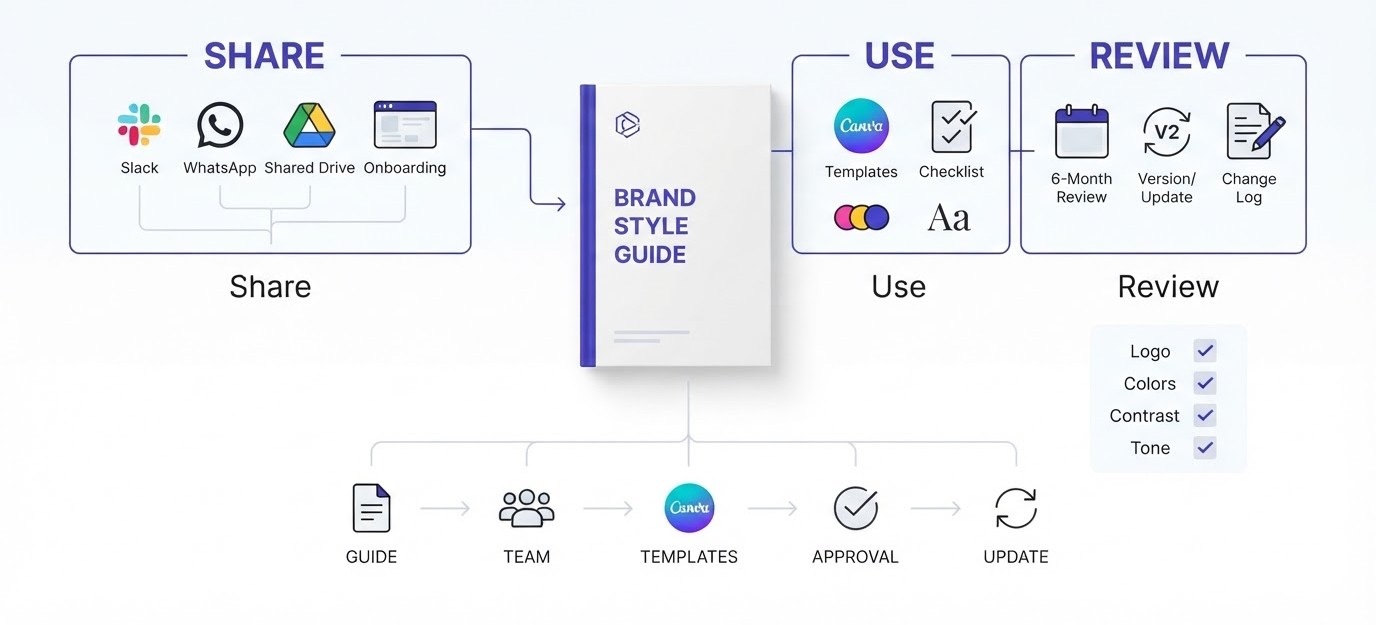
Do not just email a link and hope. Walk the team through it in a 20 minute call and show two or three real examples of the guide settling a decision. Pin the link in your Slack or WhatsApp group, add it to your onboarding checklist, and put it in the footer of your shared drive.
Better yet, make the guide the easiest path. Put the logo folder, templates and color codes one click away. If the guide is faster to use than asking a colleague, people will use it. If it takes five clicks and a password, they will not. Also tell freelancers and agencies about it on the first day of any project, and ask them to confirm they have read it before starting.
Templates, Checklists and Approvals
Rules alone do not stop mistakes. Templates and checklists do. Give people a pre-built Canva template for a Tuesday post, a slide master for presentations and a short checklist before publishing: right logo, approved colors, contrast checked, tone matches. Five checkboxes beat five pages.
Decide who approves exceptions. Maybe it is the marketing lead or the founder, but name a person, so there is no waiting around. Small teams often skip this and end up with quiet, permanent exceptions. Keep it light, though. If every post needs approval, people will route around you. Reserve sign-off for big things, like packaging, ads with large budgets or partner co-branding.
Review and Update Twice a Year
A brand changes as the business grows. A new product line, a new audience, a platform that did not exist last year. Put a reminder in the calendar every six months to review the guide, and check three things: what people ignored, what confused them, and what is missing.
Keep a simple change log at the end of the document with the date and what changed. Version numbers help when someone asks if the palette was updated. Do not rewrite the whole guide every time. Small edits, made regularly, beat a complete overhaul every three years. And if the same question lands in your inbox three times, add the answer to the guide the same day.
How to Create a Brand Style Guide in 8 Steps: A Quick Checklist
Once you have read the details, you will want a version you can pin next to your monitor. Here is the whole process boiled down into eight steps, in the order that saves the most rework. Follow them top to bottom and you will have a working guide without skipping anything important.
- Audit every logo, post, document and package your brand has already put out.
- Write the brand foundation: purpose, audience, positioning and three personality traits with “but not” lines.
- Collect logo files in every version and add clear space, minimum size and misuse examples.
- Choose two primary colors, two or three secondary colors and one accent, with HEX, RGB and CMYK codes.
- Pick two fonts, set sizes for every heading level and name a fallback font.
- Describe photo style, icon style and graphic elements, then build five templates.
- Write voice traits, tone by situation, a word list and formatting rules.
- Package it in Canva, Figma or Notion, share it live, name an owner and set a six-month review.
How Long Each Step Really Takes
Most people guess the design steps take the longest. They do not. The audit and the foundation usually eat half of your total time, because they involve looking at messy old work and making decisions you have been putting off. Expect two to four hours for the audit and about two hours for the foundation.
Logo, color and font rules move faster once those decisions exist, roughly an hour or two each. Imagery and templates take longer, maybe half a day, since you are building things. Voice and tone needs a couple of hours of writing samples. Packaging and rollout is another half day. Add it up and a small brand lands at about two working days, spread over a week if you have a day job.
A Worked Example for a Small Business
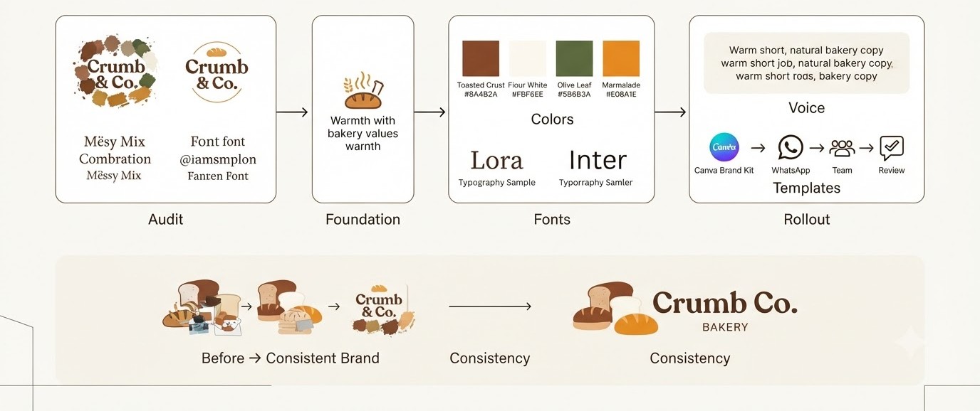
Theory only goes so far, so here is how the steps look when applied to a made-up brand. Crumb & Co. is a small bakery in Pune with a shop, an Instagram page and a Swiggy listing. It is imaginary, but every decision below is the type a real owner faces in a weekend.
The Audit and Foundation for Crumb & Co.
The owner pulls together her packaging photos, Instagram grid, Swiggy banner and a printed menu. She finds two logos, four browns that were meant to be one, and three fonts. The Swiggy banner uses bright orange that appears nowhere else. That single finding sparks a real decision about what the brand should look like.
Next, she writes the foundation in half a page. Purpose: fresh bread as an everyday thing. Audience: 25 to 40, IT workers, hungry after long days. Personality: warm but not sugary, confident but not fussy, playful but not childish. Three values, each with a behavior attached. It takes ninety minutes and already makes the next steps feel less like guessing.
The Visual Rules She Ends Up With
Her palette becomes Toasted Crust (#8A4B2A), Flour White (#FBF6EE), Olive Leaf (#5B6B3A) and a small pop of Marmalade (#E08A1E). She checks contrast in WebAIM and finds Marmalade fails on white for body text, so she restricts it to buttons and large headings. Small find, big difference for readability.
For fonts she picks Lora for headings and Inter for body, both free on Google Fonts. Her logo rules include a stacked version for the shop board, a mark-only version for profile pictures and a one-color stamp for boxes. Her photo rule is short: natural light, hands in the frame, no stock laughing people. She builds five Canva templates and stores them in the Brand Kit.
The Voice and Rollout She Chooses
Her voice traits: short sentences, warm words, real ingredient talk. A sample caption sits next to the rule: “Sourdough’s out. It won’t stay long.” A sample apology for a late delivery sits beside it, with no jokes and a small discount code. Voice stays the same, tone shifts, and the difference is clear on the page.
She saves the guide as a Canva design plus a one-page Google Doc, then shares the link with her two part-time helpers and her freelance photographer. She pins it in the team WhatsApp group and schedules a review in March and September. Total time: about two weekends. Cost: zero. Result: every post now looks like it belongs to the same bakery.
How to Create a Brand Style Guide When You Work With a Team
Doing this alone is simple, since every decision is yours. Add other people and it gets political fast. Everybody has a favorite color and a strong opinion about the logo. This part covers how to gather input without turning the whole thing into a month of arguments.
Getting Buy-In Without Endless Meetings
Start by showing the audit. Put the nine shades of green on a screen and let people react. Nobody argues for their own shade once they see it next to eight others. Then share a short draft of the foundation page and ask for edits in comments, not in a meeting. Written feedback is calmer and easier to track.
Set a deadline for comments, usually three or four days, and be clear about who makes the final call. Usually it is one person, like the founder or marketing lead. Feedback is welcome from everyone, but decisions are not a vote. A guide designed by a committee ends up with five colors nobody loves, so protect the tight palette from well-meaning additions.
Handling Feedback and Exceptions
Once the guide is live, requests for exceptions will show up. A partner wants their own color on a co-branded flyer. A regional team wants a different font for a festival campaign. Some exceptions are fair. The trick is having a quick way to say yes or no, and recording what you decided.
Keep an “approved exceptions” section at the back with a date and reason. If the same exception comes up three times, it is probably a missing rule, so add it to the main guide. If people keep requesting a rule be broken, listen, since the guide may be too strict or unclear. A guide should protect the brand, not turn into a wall that people feel they must climb over.
Mistakes When You Create a Brand Style Guide
Even people who understand how to create a brand style guide trip over the same handful of problems. Most are not about design at all. They come from doing too much, hiding the guide, or writing rules no human can follow. Here are the ones worth dodging.
Making It Too Long or Too Fancy
The most common mistake is building a 90-page masterpiece that took six weeks and gets opened once. Long guides feel professional, yet nobody reads them. If your team is under twenty people, aim for fewer than fifteen pages and a clear contents list. Cut anything that does not answer a question somebody actually asks.
Fancy layouts create their own problem. A guide designed to win awards can be hard to update, so it goes stale. Prefer boring and editable. A simple Canva or Google Slides file that anyone can tweak on a Tuesday afternoon will outlive a beautifully made InDesign document that only one person can open.
Vague Rules Nobody Can Follow
“Use plenty of white space.” “Keep it modern.” “Be authentic.” Nobody can act on these. Compare that with “keep at least 24 px of padding around text blocks” or “use one exclamation mark per email, maximum”. Concrete rules can be checked. Vague ones start arguments.
Test each rule by handing it to someone new. Could they follow it without asking you anything? If not, add a number, an example or a picture. This also helps when you work with outside freelancers who have never met you. A rule that only makes sense to the person who wrote it is not a rule, it is a mood.
Building It Once and Never Touching It Again
Brands evolve. If the guide still shows the logo from three years ago, people stop trusting it, and once trust goes they stop opening it. Old guides also create weird situations where the website follows one set of rules and the guide follows another.
Treat the guide like a product with owners, a change log and a calendar reminder. Give one person the job of keeping it current. It should take an hour a month at most. And when you change something on the website or packaging, update the guide that day. Future you will be very grateful.
Conclusion
Knowing how to create a brand style guide is really about making small decisions once so nobody has to make them again. Audit what exists, set your foundation, lock the logo, colors, fonts, imagery and voice, package it in a tool your team already uses, and keep it current. Ten sharp pages beat sixty ignored ones every time.
Start this week with the audit. Open a folder, pull in everything your brand has published, and write down the five biggest inconsistencies. Then pick the fix that takes the least effort and do it. When you want more practical lessons on design, marketing and building a brand, keep exploring the free learning hub for the next step.
Frequently Asked Questions
What is a brand style guide?
A brand style guide is a document that explains how a brand should look and sound. It usually covers the logo, colors, fonts, imagery and tone of voice, with examples of correct and incorrect use. Teams, freelancers and agencies use it to keep every design and piece of writing consistent.
How long does it take to create a brand style guide?
A small business can finish a solid guide in a weekend to two weeks, depending on how many assets already exist. Most of the time goes into the audit and the decisions, not the design. Larger companies with several products and stakeholders often take one to three months.
What should be included in a brand style guide?
At minimum, include a brand overview, logo rules, color palette with codes, typography with sizes, imagery guidelines, and voice and tone. Useful extras are social media templates, email signature rules, icon sets, and contact details for asking questions. Start with the basics and add sections only when people ask for them.
Can I create a brand style guide for free?
Yes. Canva’s free plan, Google Slides, Google Docs and Notion are enough to build a clear guide. Coolors and Google Fonts are free for palettes and typefaces, and the WebAIM Contrast Checker is free too. Paid tools like Frontify or Zeroheight are only worth it for larger teams needing version control.
How many pages should a brand style guide be?
Most small brands do well with 8 to 15 pages. Startups with multiple products may need 20 to 30. Anything beyond that should probably be split into separate design, content and product documents. Length matters less than clarity, so cut any page that does not answer a real question.
What is the difference between a brand style guide and a brand book?
A style guide is a practical rulebook used daily by designers and writers. A brand book is usually a more polished, story-driven document that explains the brand’s history, values and vision, and it is often used for onboarding or investor conversations. Many companies combine both into one document.
How many colors should a brand have?
Most brands work well with two primary colors, two or three secondary colors and one accent. That gives enough flexibility for websites, social posts and print without turning designs messy. Each color needs HEX, RGB and CMYK values, and every text and background pairing should pass WCAG contrast checks.
How many fonts should a brand use?
Two fonts is the usual limit: one for headlines and one for body text. Some brands use just one family in different weights. More than two typefaces tends to make layouts look inconsistent. Also pick a fallback font for situations where your brand font is unavailable, like email or shared documents.
Who should be involved in creating a brand style guide?
Involve the people who use the brand daily: designers, social media managers, sales and customer support. The founder or marketing lead should own the final decisions. Asking users early reveals real problems, and it also makes them more likely to follow the guide once it is finished.
How often should I update my brand style guide?
Review it every six months and update it whenever the brand changes, such as a new product, logo tweak or new platform. Keep a change log with dates so people know they have the latest version. Small regular updates work better than a huge rewrite every few years.
Do small businesses and freelancers really need a brand style guide?
Yes, and often more than big companies, because small teams change hands quickly. A freelancer working with clients, or a shop working with a rotating set of designers, gets consistent results with a simple guide. Even a two-page document with colors, fonts, logo and voice saves hours every month.
What tools are best for creating a brand style guide?
Canva is easiest for small brands, and its Brand Kit keeps assets in one place. Figma suits design-led teams. Notion and Google Docs work well for text-heavy guides, and Frontify or Zeroheight suit larger organizations. The best tool is the one your team already uses every day.