


Open any analytics dashboard for almost any website in 2026 and you’ll see the same story repeating. Somewhere between 55% and 70% of the traffic is landing on a phone screen, not a laptop. And yet, walk through a dozen random sites, and you’ll still find text that’s too small to read without pinching, buttons packed so close together that a thumb hits the wrong one every third tap, and menus that behave like someone copy-pasted a desktop navigation bar and hoped for the best. That gap between where the traffic actually comes from and where the design effort actually goes is the whole reason designing for mobile deserves its own conversation instead of being treated as an afterthought to “the real design,” which usually means the desktop version.
Here’s the thing nobody tells beginners early enough: a phone screen isn’t a smaller desktop screen. It’s a completely different context. Someone browsing on a 6.1 inch display is often standing on a train, holding a coffee in one hand, glancing at a screen for four seconds before switching to something else. Someone on a 27 inch monitor is usually sitting, focused, with a mouse and a full attention span. Designing for mobile means designing for interruption, for thumbs instead of cursors, for slower connections, and for a screen where every pixel of vertical space actually matters. It’s less about fitting more in and more about deciding what earns the right to be there at all.
This guide walks through what actually changes when you shift your thinking to mobile-first, the core principles that separate a usable app from a frustrating one, the navigation patterns that hold up under real use, the mistakes that show up again and again on sites built by people who never tested on an actual phone, and the tools and checklists that make the whole process less guesswork and more repeatable process. By the end, you’ll have a working framework you can apply to your next project, whether that’s a landing page, a full product, or a redesign of something that’s currently losing mobile visitors without anyone quite knowing why.
What You Will Learn in This Guide
- Why mobile screens demand a different design approach than desktop, not just a smaller version of the same layout
- The core principles behind touch targets, spacing, typography, and visual hierarchy on small screens
- Which navigation patterns actually work on phones, and which ones look good in a mockup but fail in real use
- The most common mistakes that quietly kill mobile conversion rates and user retention
- The tools professional designers use to prototype, test, and validate mobile experiences before launch
- A practical, step-by-step checklist you can run through before shipping any mobile design
Why Designing for Mobile Screens Requires a Different Mindset

Designing for mobile means starting from the constraints of a small screen, a single thumb, and a distracted user, rather than starting with a full desktop layout and trimming it down afterward. That single shift in starting point changes almost every decision that follows, from how content gets prioritized to how much white space a layout can actually afford. Most design failures on phones don’t come from bad taste. They come from designers who built the desktop version first and treated mobile as a resizing exercise instead of its own design problem.
Think about the difference in raw numbers for a second. A typical laptop screen gives you somewhere around 1440 by 900 pixels of usable space. A phone gives you roughly 390 by 844, and a good chunk of that is eaten up by the status bar, the browser’s address bar, and whatever navigation the operating system insists on showing. That’s not a small reduction. That’s working with less than a third of the space, while somehow needing to communicate the same value proposition, the same call to action, and often the same amount of information.
Screen Size and Thumb Reach Change Everything
A phone screen isn’t just smaller, it’s held differently, which changes where content should physically sit on the page. Most people hold their phone in one hand and operate it with their thumb, which means the top corners of the screen, especially the top left, are genuinely hard to reach without shifting grip. Steven Hoober’s research on how people actually hold phones found that around 75% of interactions happen with the thumb alone, and the thumb’s natural arc covers the bottom two-thirds of the screen far more comfortably than the top.
That’s why you’ll notice more and more apps moving primary actions to the bottom of the screen instead of the top. Instagram’s camera and post buttons live at the bottom. TikTok’s entire interaction model, likes, comments, shares, sits along the right edge and bottom, exactly where a thumb naturally rests. Compare that to a site with a “Buy Now” button crammed into the top right corner, the single hardest spot on the whole screen to hit one-handed, and you can see why conversion rates suffer even when every other part of the design looks polished.
Attention Spans and Context of Use
Mobile users aren’t reading, they’re scanning, and they’re doing it in bursts of a few seconds while dealing with real-world distractions like walking, waiting in line, or half-watching a show. Nielsen Norman Group’s eye-tracking studies on mobile reading behavior consistently show that people fixate less and skip more on small screens compared to desktop, which means dense paragraphs that might work fine on a blog read on a laptop become a wall of text nobody actually finishes on a phone.
This is exactly where short paragraphs, clear headings, and front-loaded key information stop being a nice-to-have and become the difference between someone staying on the page or bouncing. If the value of your app or page isn’t obvious within the first screen a person sees without scrolling, most mobile visitors won’t scroll to find out. Designing for mobile means treating the first visible screen, often called “above the fold” even though that term comes from newspapers, as the entire pitch, not just the opening line.
Network Speed and Data Constraints
Not every mobile user is on fast wifi with unlimited data, and designing as if they are is one of the fastest ways to lose people in markets where 4G is inconsistent or data plans are limited. A page loaded with unoptimized 4MB hero images might load in under a second on an office wifi connection and take eight to ten seconds on a mobile network in a lower-connectivity area, and Google’s own research has repeatedly shown that bounce rates climb sharply once load time crosses the three-second mark.
This isn’t purely a technical concern that belongs to developers. Design decisions directly cause a lot of this weight. Every extra font weight loaded, every unnecessary background video, every unoptimized image asset adds to what the browser has to pull down before a person sees anything useful. A designer who understands basic performance implications, even without writing code, makes very different choices about how many custom fonts to use or how large a hero image needs to actually be.
Core Principles of Designing for Mobile Interfaces
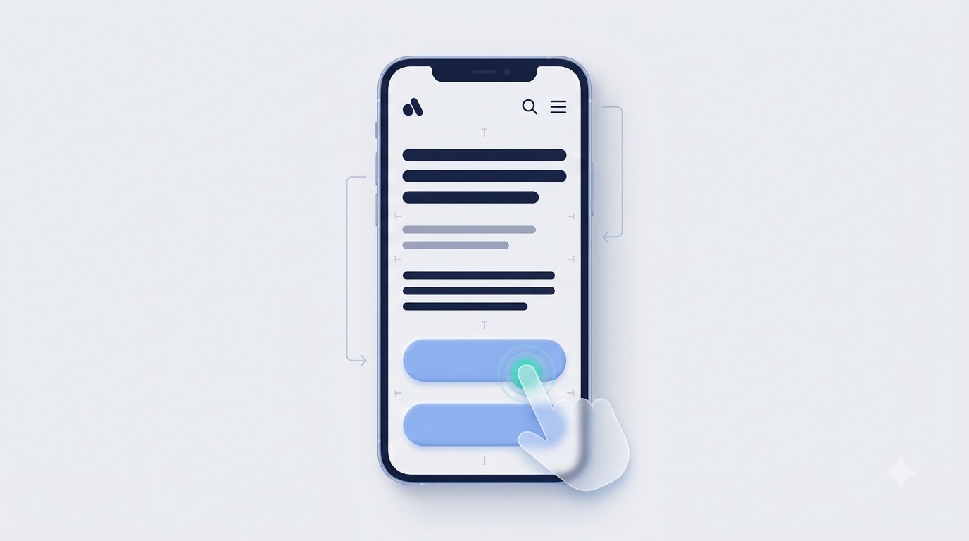
The core principles of designing for mobile interfaces come down to a handful of rules that, once internalized, apply to almost every screen you’ll ever build: start with mobile constraints first, make every tap target big enough for a real thumb, build a visual hierarchy that guides the eye without a second thought, and choose typography that stays readable at arm’s length. These aren’t abstract design theory, they’re the practical difference between an interface that feels natural and one that fights the user at every step.
Here’s what most beginner guides skip: these principles interact with each other. A touch target that’s technically big enough but placed with poor spacing still causes mis-taps. Typography that’s technically legible but poorly hierarchized still confuses users about what to read first. Treating each principle as an isolated checkbox instead of part of a connected system is exactly why some designs pass every individual “rule” and still feel clumsy in practice.
Mobile-First Design vs Responsive Design
Mobile-first design means designing the smallest screen size first and then expanding the layout upward for larger screens, rather than designing for desktop and shrinking it down, and the difference in output quality between these two approaches is bigger than most people expect. When you start mobile-first, you’re forced to make hard prioritization decisions early: what actually needs to be on this screen, what can wait, what’s genuinely essential versus what’s just familiar. Those decisions tend to produce cleaner desktop layouts too, because the clutter never got added in the first place.
Responsive design, on the other hand, is the technical mechanism that lets one layout adapt across screen sizes using flexible grids, relative units, and CSS media queries, and it works alongside mobile-first thinking rather than replacing it. You can build a responsive layout that started desktop-first and simply squeezes columns into rows on smaller screens, but that’s a different outcome from one that started mobile-first and expanded outward. Brad Frost’s original mobile-first arguments back in the early 2010s made this point clearly: constraints breed creativity, and starting small forces better decisions than starting big and cutting.
A practical way to apply this: open a new design file and set your artboard to 375 pixels wide before you touch anything else. Not 1440. Force yourself to solve the layout problem at the smallest realistic size first, then scale up. Nine times out of ten, what you build at that size ends up being the cleaner, more focused version even after you expand it for tablet and desktop.
Touch Target Sizes and Spacing
Every tappable element on a mobile screen needs to be large enough for an actual human thumb to hit reliably, and both Apple’s Human Interface Guidelines and Google’s Material Design specify a minimum touch target of 44 by 44 points on iOS and 48 by 48 density-independent pixels on Android. Anything smaller than that, and you start seeing mis-taps climb, especially for users with larger hands, users on the move, or older users with less precise motor control. This is one of those rules that seems minor until you watch a usability test and see someone tap the wrong icon three times in a row out of pure frustration.
Spacing matters just as much as size. Two buttons that individually meet the 44 point minimum but sit right next to each other with no gap will still cause accidental taps, because thumbs don’t land with pixel precision. The general recommendation is at least 8 pixels of space between adjacent touch targets, more if the actions have different consequences, like a “Delete” button sitting next to a “Save” button. That combination, a destructive action right next to a routine one with insufficient spacing, is a specific, avoidable design mistake that shows up constantly in poorly tested apps.
Visual Hierarchy on Small Screens
Visual hierarchy on mobile has to work harder with less space, using size, weight, color, and position to tell the eye exactly what to look at first, second, and third within a screen that might only show 600 pixels of vertical content before requiring a scroll. On desktop, you have room to let multiple elements compete for attention because there’s enough real estate to separate them visually. On mobile, everything is closer together, so hierarchy decisions become the primary tool for preventing visual noise.
A practical framework: pick one primary action per screen and make it visually dominant through size and contrast, not just color. A common mistake is using color alone to signal importance, a blue button among gray text, for example, without varying size or weight, which fails for anyone with color vision deficiency and honestly doesn’t do enough work even for people with typical vision. Combine at least two visual signals, size and weight together, or contrast and position together, so the hierarchy holds up regardless of how quickly someone is scanning.
Look at how banking apps typically handle this. The account balance sits large and bold at the top, immediately visible. Below it, transaction history uses smaller, lighter text because it’s secondary information the user can scan but doesn’t need to process instantly. The “Send Money” or “Transfer” action usually gets its own visually distinct button, separated from the list content entirely, so it never competes for attention with information the user is scanning past.
Typography Rules for Mobile Screens
Body text on mobile should sit at a minimum of 16 pixels, with line height around 1.4 to 1.6 times the font size, because anything smaller forces users to zoom in, which is a hard signal that a design has failed at its most basic job of being readable. This isn’t an arbitrary number. Apple and Google both settled on similar minimums after years of readability research, and 16 pixels roughly corresponds to what most people can read comfortably at typical phone-to-eye distance, somewhere between 12 and 16 inches, without squinting or zooming.
Line length matters too, and it’s a rule that gets ignored constantly on mobile because the screen is narrow enough that it feels like it shouldn’t be a problem. It still is. Lines that are too short, under about 30 characters, force the eye to jump lines too frequently, which actually slows reading speed and increases fatigue, especially in long-form content like articles or blog posts read on a phone. The ideal range for mobile body text sits around 45 to 75 characters per line, which usually means giving text blocks reasonable side padding rather than letting them stretch edge to edge.
Font weight and contrast finish the job. Light font weights that look elegant on a high-resolution desktop monitor often become nearly illegible on cheaper phone displays with lower contrast ratios, particularly in bright outdoor light, which is a very common real-world mobile context. The Web Content Accessibility Guidelines recommend a contrast ratio of at least 4.5 to 1 for normal body text, and that’s a floor, not a target to aim exactly at. Testing a design outdoors under direct sunlight, not just on a desk under office lighting, catches contrast problems that look completely fine indoors.
Navigation Patterns for Designing for Mobile Apps and Websites
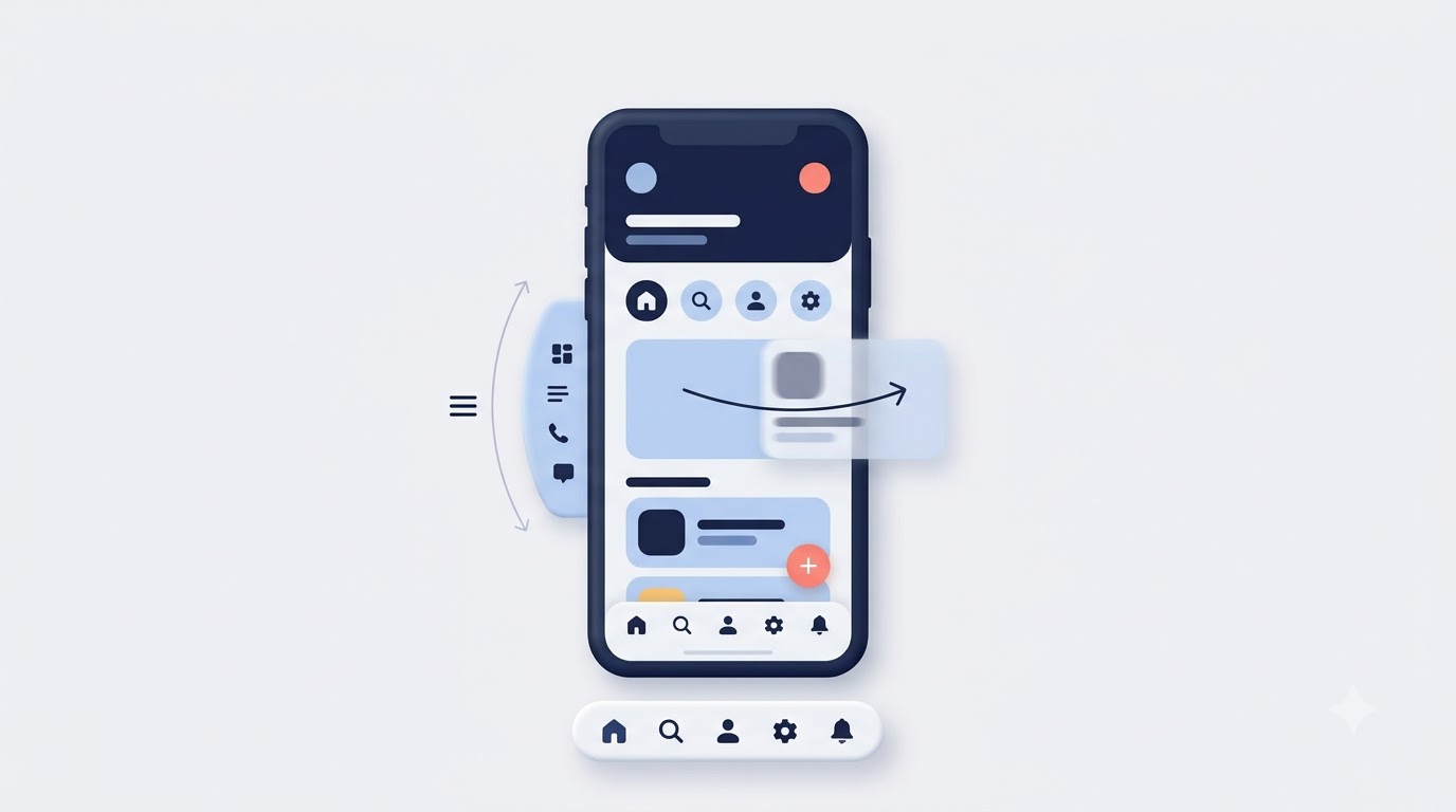
Navigation patterns on mobile need to account for one-handed use, limited screen space, and the reality that users can’t see an entire menu structure at once the way they might scan a desktop nav bar with ten links across the top. The three patterns that show up most often in well-designed mobile products, bottom navigation bars, hamburger menus, and gesture-based interactions, each solve different problems and fail in different situations, so picking the right one depends heavily on how many primary destinations your app or site actually has.
A mistake that trips up a lot of beginner designers is treating navigation as a single decision to make once, rather than something that needs testing against real content and real user flows. A navigation pattern that looks clean in a static mockup with five menu items can completely fall apart once real content, notification badges, and edge cases like a logged-out state get added in.
Bottom Navigation Bars
Bottom navigation bars place the three to five most important destinations in a persistent bar at the bottom of the screen, exactly where a thumb naturally rests, and they work best when an app has a small, stable set of top-level sections that a user needs to jump between constantly. Instagram uses this pattern for Home, Search, Reels, Shop, and Profile. Spotify uses it for Home, Search, and Your Library. In both cases, the number of destinations stays small and doesn’t change based on context, which is exactly the condition under which bottom navigation performs best.
The strength of this pattern is visibility. Unlike a hidden hamburger menu, every option is visible at all times, which research from Luke Wroblewski and later confirmed repeatedly by Nielsen Norman Group shows increases usage of secondary sections that would otherwise get ignored behind a tap. If “Search” lives behind a hidden menu, fewer people use search at all, simply because it’s not sitting there as a visual reminder. Bottom navigation solves that by keeping every core option one tap away, always visible, always in the same place regardless of what screen the user is currently on.
The limitation is capacity. Cramming more than five items into a bottom bar makes each icon smaller and harder to tap accurately, which defeats the whole purpose. If your app genuinely needs more than five top-level sections, that’s usually a sign the information architecture needs rethinking before it needs a navigation redesign, because no navigation pattern comfortably handles eight equally important destinations without something getting buried.
Hamburger Menus: When They Help and When They Hurt
A hamburger menu, the three-line icon that reveals a hidden navigation panel, works well when there are many navigation options that don’t need constant visibility, but it actively hurts discoverability when it’s used to hide primary actions a user needs frequently. The pattern got a lot of criticism in UX circles around 2014 to 2016, largely because early implementations hid things like search and cart, actions people needed constantly, behind an icon that a lot of users simply never tapped because it didn’t look obviously interactive.
The honest answer on hamburger menus isn’t “never use them,” it’s “use them for the right content.” A content-heavy site with fifteen category pages, a settings menu with account options someone visits rarely, secondary navigation on an e-commerce site after the main categories are already visible elsewhere, these are reasonable places for a hamburger pattern. What doesn’t belong there is anything the user needs on almost every visit: search, cart, primary product categories on a shopping app. Those need to stay visible, not buried behind an extra tap that a meaningful chunk of users won’t take.
A middle-ground pattern that’s become common is combining the two: a bottom bar for the three or four things people do constantly, plus a hamburger or “More” icon within that same bottom bar for everything else. This gives you the visibility benefits of bottom navigation without forcing every possible destination into a cramped five-icon bar.
Gestures and Swipe Interactions
Gestures like swipe-to-delete, pull-to-refresh, and swipe-between-tabs can make an interface feel fast and natural, but they carry a real discoverability problem because, unlike a visible button, a gesture gives no visual hint that it exists until someone accidentally discovers it or gets told about it. This is the core tension with gesture-based design: it’s efficient for people who already know the gesture and confusing or invisible to people who don’t.
The apps that use gestures well almost always pair them with a visible fallback or a subtle hint. Gmail’s swipe-to-archive works because there’s still a visible archive button inside the email itself for anyone who doesn’t discover the swipe. iOS’s pull-to-refresh includes a small loading spinner animation the first few times, which teaches the gesture through repetition rather than requiring a tutorial screen. That combination, a discoverable primary path plus a faster gesture shortcut for repeat users, is what separates gestures that genuinely improve the experience from gestures that just look impressive in a portfolio piece and confuse real users.
A common mistake is relying on a gesture as the only way to complete an important action, with no visible alternative at all. If deleting an item is only possible through a swipe gesture that a first-time user has no reason to discover, you’ve made a core function invisible. Test this specifically: watch someone who’s never used the app try to complete every important task using only what’s visible on screen, with no gesture hints given beforehand. Whatever they can’t figure out is exactly the point where a gesture-only interaction needs a visible backup.
For anyone building this out on the web rather than in a native app, this is a good moment to go deeper into the coding side of implementing responsive touch behavior, which is covered in more depth in the web development learning path if you want to understand how these interactions actually get built with CSS and JavaScript rather than just designed.
Common Mistakes to Avoid When Designing for Mobile Screens
Most mobile design failures trace back to a small set of repeatable mistakes: dumping desktop content onto a mobile layout without rethinking it, ignoring how design choices affect load speed, building forms that fight the user instead of helping them, and forgetting accessibility entirely until a complaint or an audit forces the issue. None of these are exotic problems. They’re the same handful of mistakes showing up on site after site, app after app, largely because they’re easy to miss when a design only gets reviewed on a large monitor.
The pattern connecting all of them is the same: these mistakes are invisible to the person who built the desktop version first and adapted it down, and painfully obvious to anyone actually holding a phone and trying to complete a task under real conditions, with one thumb, imperfect lighting, and a connection that isn’t always great.
Cramming Desktop Content Into Mobile Layouts
The single most common mistake in mobile design is trying to preserve every piece of desktop content instead of asking what actually needs to survive the transition to a smaller screen. A desktop homepage with six feature blocks, three testimonials, a newsletter signup, and a footer full of links might look complete and thorough on a 1440 pixel screen. Stack all of that vertically on a 375 pixel phone screen, and you get an endless scroll that buries the actual call to action somewhere around screen twelve, long after most visitors have already left.
The fix isn’t shrinking everything proportionally, it’s re-prioritizing. Ask, for each section, whether it earns a spot above the point where most mobile users stop scrolling, which research generally puts somewhere around the first two to three screen heights on a typical session. Content that doesn’t clear that bar either needs to move further down with the understanding that fewer people will see it, or get cut entirely. A good exercise: take the desktop wireframe, list every section, and rank them by actual conversion impact, not by how much effort went into building them. The bottom half of that list is exactly what mobile design should be willing to compress or remove.
Ignoring Load Speed and Performance
Design decisions directly cause performance problems more often than people realize, and a slow-loading mobile page is a design failure just as much as a technical one, because the fastest-loading version of a page is always the one users actually stick around to see. A hero section built with a 5MB uncompressed PNG instead of a properly compressed WebP file might look identical on a fast connection and take an extra four to six seconds to load on a mobile network, which is more than enough time to lose a meaningful percentage of visitors before they see anything at all.
Google’s Core Web Vitals, specifically Largest Contentful Paint, Cumulative Layout Shift, and Interaction to Next Paint, exist precisely because performance affects real user experience and, by extension, search rankings. A design that shifts content around as images and fonts load in, the classic experience of trying to tap a button right as an ad or image pushes it down the page, actively damages both usability and CLS scores. The fix at the design stage is straightforward: specify image dimensions before development starts so layout doesn’t shift, limit custom font weights to two or three instead of six, and treat every added asset as something that has to justify its weight against load time, not just against how it looks in isolation.
Poor Form Design and Input Fields
Forms are where mobile usability problems become most obvious most quickly, because typing on a phone keyboard is inherently slower and more error-prone than typing on a physical keyboard, which means every unnecessary field or confusing input type multiplies frustration. A signup form with eight fields, including ones like “company name” or “how did you hear about us” that aren’t actually required to create an account, is a conversion killer on mobile specifically, even if the same form performs acceptably on desktop where typing is faster.
Input type matters more than most designers give it credit for. Setting the correct HTML input type, type="email" for email fields, type="tel" for phone numbers, type="number" for numeric fields, triggers the correct mobile keyboard automatically, showing an @ symbol prominently for email or a numeric pad for phone numbers. Skipping this and defaulting every field to a generic text keyboard forces users to manually switch keyboard layouts, a small friction that adds up across a multi-field form and measurably increases abandonment rates.
Label placement causes another common issue. Placeholder text that disappears the moment someone starts typing, used as the only label, means users lose context about what they’re filling in if they get interrupted mid-form, which happens constantly on mobile given how easily a phone gets set down or a notification pulls attention away. Persistent labels that stay visible above or beside the field, even after typing begins, solve this and cost almost nothing in terms of visual space.
Forgetting Accessibility
Accessibility on mobile isn’t a separate checklist item, it’s baked into most of the principles already covered, touch target size, color contrast, font size, and ignoring it locks out a meaningful percentage of users while also, in a growing number of regions, creating real legal risk. The World Health Organization estimates that over a billion people globally live with some form of disability, and a large share of that population uses smartphones as their primary or only internet access point, which makes mobile accessibility a much bigger issue than a niche edge case.
Screen reader compatibility is where a lot of mobile designs fail without anyone noticing during a purely visual review. Icons used without accessible labels, meaning a screen reader user hears nothing meaningful when focus lands on that element, are extremely common, especially in icon-only navigation bars. Every interactive icon needs an accessible label, even if it’s visually just a magnifying glass or a trash can icon, so that VoiceOver on iOS or TalkBack on Android can actually describe what the button does.
Color contrast failures show up constantly too, particularly with light gray text on white backgrounds, a trend that’s aesthetically popular but frequently fails the WCAG 4.5 to 1 contrast minimum for body text. Running a design through a contrast checker before development starts, rather than discovering the problem in a post-launch audit, saves a full round of rework later. This is a good habit to build early if design or front-end work is a direction worth investing in more seriously, and the fundamentals get covered in more structured depth in the graphic design learning track alongside broader visual hierarchy and layout principles.
Tools, Testing, and a Practical Checklist for Designing for Mobile

Designing for mobile properly requires the right prototyping tools, real device testing rather than relying entirely on simulators, and a repeatable checklist to run before anything ships, because good instincts alone don’t catch every edge case that shows up once real users with real thumbs and real phones start interacting with a design. The tools matter less than the habit of actually using them consistently, but knowing which tools professionals reach for saves a lot of trial and error for anyone just getting started.
Prototyping Tools Worth Learning
Figma has become the default tool for mobile UI design for most teams, largely because its component and auto-layout features make it far easier to build responsive, reusable elements compared to older tools like Sketch or Adobe XD, and because it runs in the browser, which removes a lot of collaboration friction between designers and developers reviewing the same file. Building a mobile design system in Figma using components for buttons, form fields, and navigation elements means changes propagate automatically across every screen using that component, instead of requiring manual updates across dozens of individual frames.
Adobe XD still has a following, particularly among teams already embedded in the Adobe ecosystem, and it handles prototyping interactions, tapping through screens to simulate a real app flow, reasonably well. The bigger point regardless of which tool gets chosen: build and test the actual interactive prototype, not just static screens. A static mockup hides problems that only show up once someone can actually tap through a flow, like a modal that covers the only way to go back, or a form that doesn’t clearly show which field has an error after a failed submission.
Testing on Real Devices vs Emulators
Emulators and browser dev tools are useful for quick checks during development, but they consistently miss problems that only appear on real hardware, things like actual touch responsiveness, how a design looks under real ambient lighting, or how battery-saving modes affect animation performance. A layout that looks perfectly fine in Chrome’s device toolbar, set to simulate an iPhone at 390 by 844, can still behave differently on an actual iPhone because of how Safari specifically handles viewport units, address bar collapsing, or safe area insets around the notch and home indicator.
Testing on at least two or three real devices, ideally one budget Android phone with a smaller, lower-resolution screen and one recent iPhone, catches a surprising number of problems that never show up in simulation. Budget Android devices in particular often have smaller screens, around 5.5 to 6 inches, combined with lower pixel density, which can expose typography and spacing issues that look completely fine on a high-end device with a large, sharp display. If a dedicated device testing budget isn’t realistic, tools like BrowserStack give access to a wide range of real device screenshots and interactions remotely, which is a reasonable middle ground for smaller teams or solo designers.
A Pre-Launch Checklist
Running through a fixed checklist before every mobile launch catches the kind of small, easy-to-miss problems that individually seem minor but collectively determine whether a design feels polished or sloppy. Here’s a working version worth adapting to your own projects:
- Every touch target measures at least 44 by 44 points, with a minimum of 8 pixels of spacing between adjacent tappable elements
- Body text sits at 16 pixels minimum, with line height between 1.4 and 1.6 times the font size
- Color contrast for text meets the 4.5 to 1 ratio minimum, checked with an actual contrast tool, not eyeballed
- Forms use correct input types so the right keyboard appears automatically, and labels stay visible even after typing begins
- Images are compressed and properly sized for mobile viewports, not just scaled-down desktop assets
- The design has been tested on at least two real physical devices, not just a browser emulator
- Every icon-only button has a proper accessible label for screen readers
- The primary call to action is visible within the first screen height without requiring a scroll
- Any gesture-based interaction has a visible, discoverable fallback for users who don’t know the gesture exists
This kind of checklist earns its value specifically because it’s boring and repeatable. The mistakes it catches are never dramatic on their own, but they’re exactly the kind of small friction points that compound into a design that feels off without an obvious single reason why.
A Real-World Style Walkthrough
Picture a small e-commerce brand redesigning its product page for mobile after noticing a much higher bounce rate on phone traffic compared to desktop, a pattern that shows up constantly once teams actually segment their analytics by device. The original desktop-first product page had a two-column layout, images on the left, description and buy button on the right, that got stacked vertically for mobile without any real rethinking. The result: the “Add to Cart” button ended up buried below a full product description, several customer reviews, and a related products carousel, meaning a mobile visitor had to scroll past a screen and a half of content just to find the button that actually converts.
The fix followed the principles already covered in this guide. The buy button moved into a sticky bar pinned to the bottom of the screen, always visible regardless of scroll position, which is the same bottom-navigation logic applied to a single high-value action instead of a full nav bar. Product images got compressed and lazy-loaded, meaning images below the fold don’t load until the user scrolls near them, which cut initial page weight significantly and improved Largest Contentful Paint scores. The description got restructured with a short two-sentence summary visible by default and a “Read more” expansion for the full details, respecting the reality that most mobile visitors scan rather than read everything up front.
None of these changes required a redesign from scratch. Each one addressed a specific, identifiable problem: burying the primary action, unnecessary page weight, and content that demanded more reading commitment than most mobile visitors were willing to give. That’s usually how real mobile design improvements happen in practice, not as one big overhaul but as a series of targeted fixes once you know exactly what to look for. Anyone wanting to build this kind of structured, end-to-end design and development skill set rather than picking it up piecemeal might find the Web Development Mastery Program a useful next step, since it covers both the design decisions and the technical implementation side together.
For teams comparing different design and prototyping software before committing to one, a side-by-side breakdown of the major options is worth checking in the tools section, which covers pricing, feature sets, and which tool fits which team size.
Conclusion
Designing for mobile isn’t about making a smaller version of something built for a bigger screen. It’s about starting from the constraints, thumb reach, screen size, attention span, network speed, and building outward from there, so nothing important ever depended on space that never actually existed. The principles covered here, correct touch target sizing, clear visual hierarchy, readable typography, navigation patterns that match how people actually hold and use their phones, and a habit of testing on real devices instead of trusting a simulator, aren’t complicated individually. What makes them hard is applying all of them consistently, on every screen, instead of getting them right on the homepage and forgetting about them three screens deep into a checkout flow.
Anyone serious about getting better at this should pick one existing mobile design, either something built already or a competitor’s app, and run it through the checklist in this guide screen by screen. That single exercise, done honestly, will surface more real, actionable problems than reading another ten articles on mobile design theory ever will.
Frequently Asked Questions
What is mobile-first design?
Mobile-first design is an approach where a layout gets designed for the smallest screen size first, then expanded and adapted for larger screens like tablets and desktops. It forces early prioritization of content and features, since limited screen space makes it obvious what actually matters versus what’s just extra clutter carried over from habit.
How big should touch targets be on mobile?
Touch targets should measure at least 44 by 44 points on iOS or 48 by 48 density-independent pixels on Android, based on Apple’s Human Interface Guidelines and Google’s Material Design specifications. Anything smaller increases mis-taps, especially for users with larger hands or anyone using their phone while walking or distracted.
Is responsive design the same thing as mobile-first design?
No. Responsive design is the technical method, using flexible grids and media queries, that lets one layout adapt across screen sizes. Mobile-first is a design philosophy about which screen size to design for first. A layout can be responsive without being mobile-first if it was originally designed for desktop and simply adapted downward afterward.
What’s the minimum font size for mobile body text?
Sixteen pixels is the generally accepted minimum for mobile body text, with a line height between 1.4 and 1.6 times the font size for comfortable reading. Anything smaller typically forces users to zoom in, which is a strong signal that the typography choices need revisiting.
Should I use a hamburger menu or a bottom navigation bar?
Bottom navigation bars work best when there are three to five equally important destinations users need constantly, since every option stays visible. Hamburger menus work better for content that doesn’t need constant visibility, like account settings or secondary categories, since hiding frequently needed actions behind a hamburger icon typically reduces how often those features get used.
Why does my mobile site load slower than my desktop site?
Mobile load speed usually suffers from the same page assets, uncompressed images, too many font weights, unoptimized scripts, being served to a device on a slower network connection with less processing power than a typical desktop or laptop. Compressing images, limiting custom fonts, and specifying image dimensions to prevent layout shifts are the most common fixes.
What contrast ratio do I need for accessible mobile text?
The Web Content Accessibility Guidelines recommend a minimum contrast ratio of 4.5 to 1 for normal body text and 3 to 1 for larger text, such as headings above 18 points bold or 24 points regular. This is a floor to meet, not a target to aim exactly at, since real-world conditions like bright outdoor light often demand more contrast than the bare minimum provides.
How do I test mobile designs without owning every device?
Tools like BrowserStack provide remote access to real device screenshots and interactions across a wide range of phones and operating systems without needing to own each one physically. For teams with some budget, testing on at least one budget Android device and one recent iPhone directly still catches issues that pure emulation misses, particularly around touch responsiveness and safe area handling.
Are swipe gestures good or bad for mobile UX?
Swipe gestures aren’t inherently good or bad, but they carry a discoverability problem since, unlike a visible button, nothing on screen signals that a gesture exists until a user stumbles onto it. Gestures work best when paired with a visible fallback, like Gmail’s swipe-to-archive existing alongside a visible archive button inside the email itself.
What’s the biggest mistake beginners make when designing for mobile?
The most common beginner mistake is designing the desktop version first and shrinking it down for mobile afterward, rather than starting with mobile constraints from the beginning. This usually results in cramped layouts, buried calls to action, and content prioritization decisions that never actually accounted for how little space a phone screen provides.
How much should I compress images for mobile?
Images intended for mobile should generally be compressed to keep file sizes well under 200KB for standard content images, using modern formats like WebP instead of uncompressed PNG or JPEG where possible. The exact number varies by image complexity, but the practical test is whether the compressed version still looks acceptable at the actual display size it will be shown at, not at full resolution.
Do I need separate designs for iOS and Android?
Not entirely separate designs, but the two platforms have different conventions worth respecting, like iOS typically placing back navigation in the top left with a swipe-back gesture, while Android traditionally relies more on a system-level back button. Most modern products use a shared design system with platform-specific adjustments for navigation patterns and native component styling rather than building two fully independent experiences.