


Think about the last time you left a website halfway through buying something. Maybe the checkout asked for your phone number three separate times. Maybe you tapped a button and nothing happened for four seconds so you assumed it was broken. Whatever it was, you didn’t leave because the product was bad. You left because using the site felt like work. That’s the whole story of user experience in one paragraph, and it’s the reason marketing teams that used to obsess purely over ad copy and email subject lines are now sitting in design reviews.
Businesses used to win by having the better product on the shelf. Now they win by making the entire path to that product painless, from the first search result someone clicks to the confirmation screen after they pay. The shift from product-focused to customer-focused thinking didn’t happen because it sounded nice in a boardroom, it happened because buyers got options. When five companies sell nearly the same thing, the one with the smoothest digital experience gets the sale, almost every time.
Modern buyers expect frictionless. Not “pretty good,” not “acceptable for a small business,” actually frictionless, the way Amazon checkout is frictionless or the way Spotify just knows what you want to hear next. That expectation didn’t exist fifteen years ago and now it’s the baseline everyone gets measured against, fair or not. And here’s the part marketers specifically need to sit with: UX isn’t a design department problem anymore. It’s tied directly to your branding, the trust people place in you, and honestly, your revenue line.
A marketer who ignores UX is running ads to a leaky bucket. You can write the best headline in the world, get the click, and still lose the sale because the landing page took six seconds to load or the form asked for twelve fields. That’s money burned, not because the marketing was bad, but because what came after the click was.
What You Will Learn in This Guide
This guide breaks down what UX design actually is, not the textbook definition, the real one. You’ll get the difference between UX and UI (people mix these up constantly), how UX and CX relate, and exactly how user experience touches every single stage of your marketing funnel, from a stranger’s first search to a repeat customer telling their friends. You’ll also walk away with the core principles good UX follows, the actual process designers use, the metrics worth tracking, common mistakes that quietly kill conversions, and a list of tools you can start using this week. Real examples from Amazon, Airbnb, Spotify, Apple, and Netflix are in here too, because theory only gets you so far.
What Is UX Design?
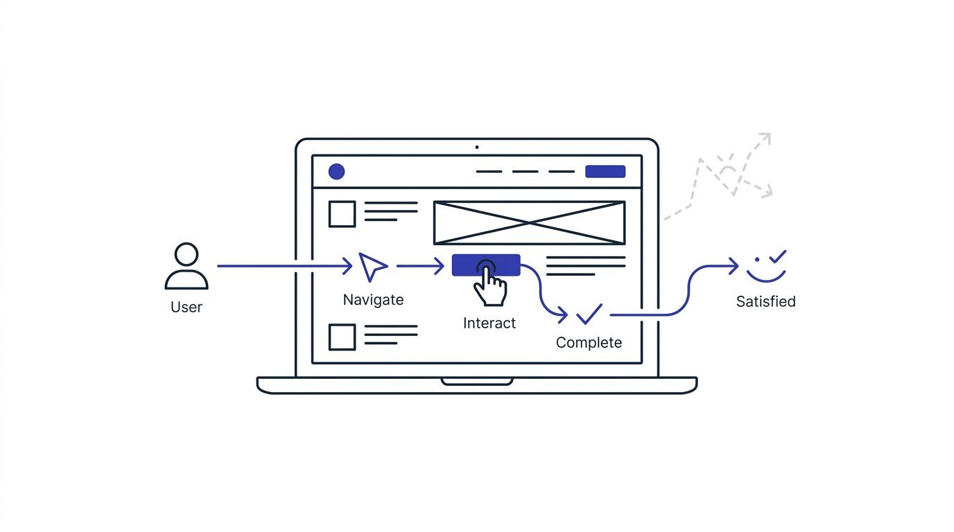
UX design, short for user experience design, is the practice of shaping how a person feels and behaves while interacting with a product, app, or website. It’s not just how something looks. It’s whether someone can find what they need, complete a task without frustration, and walk away feeling like the whole thing just worked. Good UX is invisible. You only notice it when it’s missing.
What User Experience Really Means
User experience covers every single touchpoint a person has with your brand digitally, the loading speed, the button placement, the wording on your error messages, the number of steps in your checkout. It’s cumulative too. One small annoyance won’t sink you, but five small annoyances stacked together will absolutely push someone toward a competitor without them even fully realizing why they left.
History and Evolution of UX Design
The term “user experience” was coined by Don Norman back in the 1990s while he was working at Apple, and honestly the concept existed way before the term did, industrial designers were thinking about usability for decades. What changed things was the internet going mainstream, then smartphones, then apps. Suddenly companies weren’t designing a single physical product, they were designing entire digital journeys, and the stakes for getting it wrong got a lot higher because switching to a competitor became one tap away.
Why UX Design Exists
UX design exists because people are impatient and businesses need them to not be. Nobody wants to think hard about how to use your website. If they have to stop and figure something out, that’s friction, and friction costs you customers. UX design is basically the discipline of removing every unnecessary bit of friction between someone wanting something and them getting it.
Goals of UX Design
The goal isn’t to make something look impressive in a portfolio. The real goals are usability (can people actually use it), efficiency (can they do it fast), satisfaction (does it feel good to use), and accessibility (can everyone use it, not just some people). When all four line up, you get an experience that quietly does its job without anyone complaining about it.
Real-Life Examples of Good UX
Think about how Google’s homepage is basically just a search bar and a logo. No clutter, no confusion, you know exactly what to do the second the page loads. Or how Uber shows you the driver’s location moving in real time so you’re not standing outside wondering if your ride is actually coming. These aren’t flashy features. They’re just anxiety removed at the exact moment someone would’ve felt it.
Examples of Poor UX
Ever tried to cancel a subscription and gotten sent through five confirmation screens, each one guilt-tripping you a little more? That’s intentionally bad UX, sometimes called a “dark pattern,” and while it might slow down cancellations short term, it wrecks trust long term. Another classic one: a form that clears everything you typed the second one field has an error, forcing you to start over from scratch. People remember that kind of thing, and not fondly.
Why UX Design Matters More Than Ever
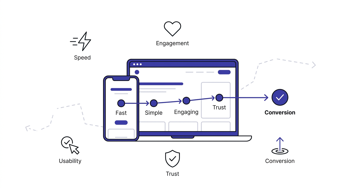
Modern users expect websites and apps to be fast, intuitive, and effortless. A poor user experience quickly drives visitors away, while a seamless experience builds trust, increases engagement, and improves conversions. As competition grows online, businesses that prioritize UX gain a significant advantage in customer satisfaction, retention, and long-term revenue.
Increasing Digital Competition
There used to be maybe two or three real options in most categories. Now there are dozens, sometimes hundreds, all a search away. When the product itself stops being the differentiator because everyone’s offering something similar, the experience of buying and using it becomes the thing people actually choose based on.
Rising Customer Expectations
People compare your checkout flow to Amazon’s whether that’s fair or not. They compare your app’s speed to Instagram’s. Expectations don’t stay within your industry anymore, they get set by the best digital experience someone used yesterday, regardless of what business that was in.
Mobile-First Users
Most traffic now comes from phones, and phones are less forgiving than desktops. Smaller screens, spottier connections, and thumbs instead of a mouse mean any UX weakness gets amplified. A slightly annoying dropdown menu on desktop becomes a genuinely frustrating one on mobile.
AI and Personalized Experiences
People are getting used to experiences that adjust to them specifically, product recommendations that feel eerily accurate, content feeds that know what they’ll click. Generic, one-size-fits-all experiences increasingly feel outdated next to that, even if the underlying product is solid.
Importance of Speed and Simplicity
Speed isn’t a nice bonus, it’s often the deciding factor. Studies on page load times consistently show bounce rates climbing sharply once load time crosses a couple seconds. Simplicity works the same way. The fewer decisions or steps someone has to make, the more likely they finish the task.
Trust and Credibility
A clean, functional, professional-feeling digital experience signals that a business is legitimate and cares about its customers. A clunky, outdated, confusing one signals the opposite, even if the actual company behind it is perfectly trustworthy. People judge books by covers online more than anywhere else.
UX Design vs UI Design
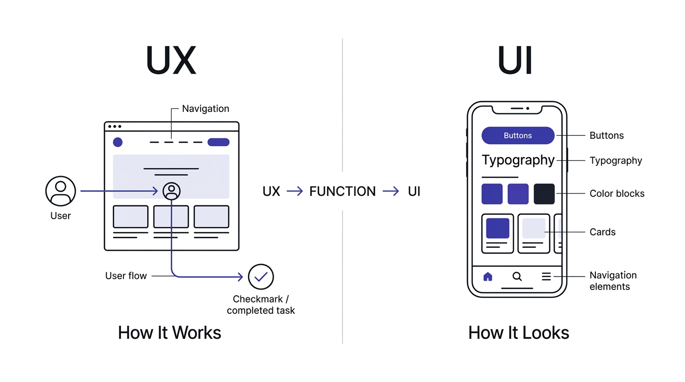
UX design focuses on the overall experience users have while interacting with a product, ensuring tasks are easy and enjoyable. UI design focuses on the visual interface, including colors, typography, buttons, and layouts. UX determines how something works, while UI determines how it looks and feels.
What Is UI Design?
UI design, user interface design, is about the visual layer, the colors, buttons, icons, typography, spacing, all the stuff you actually see and tap on screen. UI is a piece of UX, not a separate thing entirely. You could think of UI as the look, and UX as the whole feel, including things you can’t literally see like how intuitive the flow is.
Key Differences Between UX and UI
UX is concerned with the overall journey and whether it works logically. UI is concerned with how that journey is visually presented. A site can have gorgeous UI and still have terrible UX if the navigation makes no sense. Reverse it too: a site with plain, unremarkable UI can have excellent UX if everything just works exactly how you’d expect it to.
UX vs UI Comparison Table
| Aspect | UX Design | UI Design |
|---|---|---|
| Purpose | Make the experience functional and satisfying | Make the interface visually clear and appealing |
| Focus | User behavior, flow, and problem-solving | Visual elements: color, typography, layout |
| Skills | Research, wireframing, information architecture | Visual design, branding, interaction detail |
| Deliverables | User flows, personas, wireframes, journey maps | Mockups, style guides, visual prototypes |
| Tools | Miro, Optimal Workshop, user research platforms | Figma, Adobe XD, Sketch |
| Metrics | Task completion, bounce rate, conversion | Visual consistency, click accuracy, aesthetic feedback |
| Career Path | UX Researcher, UX Designer, Product Designer | UI Designer, Visual Designer, Brand Designer |
How UX and UI Work Together
Neither one works well without the other. A brilliantly structured user flow with ugly, confusing visuals still frustrates people. A beautiful interface built on a broken flow just looks nice while failing to actually help anyone. The best digital products treat these as one continuous process, not two departments handing work back and forth.
UX Design vs Customer Experience (CX)
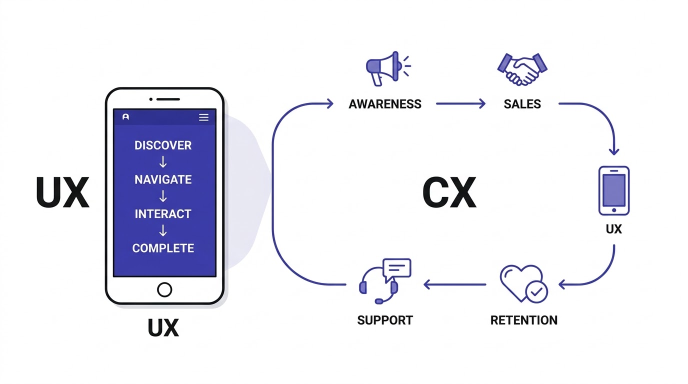
UX design focuses specifically on users’ interactions with digital products such as websites and mobile apps. Customer Experience (CX) covers the entire customer journey, including marketing, sales, support, and after-sales service. Strong UX contributes significantly to delivering a positive overall customer experience.
Understanding Customer Experience
Customer experience is the bigger picture, every interaction someone has with your brand across every channel, not just your website or app. That includes your customer service calls, your packaging if you ship physical products, your social media replies, even how your sales team talks to people on the phone.
UX vs CX
UX is one slice of CX. If UX is how someone experiences your app or site specifically, CX is how they experience your entire brand, digital and physical, before, during, and after the purchase. You can have great UX and still have bad CX if your support team takes three days to respond to an email.
Major Differences
UX designers usually focus on a specific digital product. CX teams look across the whole relationship, marketing touchpoints, sales conversations, support tickets, loyalty programs. UX is more tactical and design-focused, CX is more strategic and spans the entire organization, not just the product or design team.
Which One Is More Important?
Honestly, neither wins over the other, they need each other. Great UX can get someone through the door and converted, but if the rest of their experience with your brand is a mess, they won’t stick around or refer anyone. Treat UX as the foundation that supports the bigger CX picture, not a replacement for it.
Why UX Design Matters for Marketing
Marketing attracts visitors, but UX determines whether they stay, engage, and convert. Even the best campaigns fail if users encounter confusing navigation, slow pages, or poor usability. Great UX maximizes marketing ROI by improving user satisfaction, lead generation, conversions, and customer loyalty.
UX Creates Better First Impressions
People form an opinion about your site within seconds of it loading, sometimes before they’ve even read a word of copy. If that first impression is cluttered, slow, or confusing, no amount of clever ad targeting fixes the damage that’s already been done in that split second.
UX Builds Brand Trust
A site that feels considered, that anticipates what someone needs and makes it easy to find, signals competence. People extend that competence assumption to your actual product or service too, even before they’ve tried it, purely based on how the digital experience felt.
UX Increases User Engagement
When navigation is intuitive and content is easy to consume, people naturally explore more, read more, watch more. Engagement isn’t just a vanity metric either, it’s a strong signal that someone’s warming up toward converting, whether that’s a purchase, a signup, or a lead form.
UX Improves Lead Generation
Simplified forms, clear value propositions, and obvious next steps directly increase how many visitors actually convert into leads. A form with two fields will always outperform one with ten, assuming the value being offered is the same, because every extra field is a chance for someone to bail.
UX Reduces Bounce Rate
If someone lands on your page and immediately feels lost or the page is slow to load, they leave, and that’s a bounce. Every marketing dollar spent driving that click just got wasted. Reducing bounce rate through better UX is one of the highest-leverage things you can do for existing ad spend.
UX Increases Conversion Rate
This is the big one marketers care about most directly. Clear CTAs, logical flow, fast load times, and trust signals all compound to push more visitors toward actually completing the action you want, whether that’s a purchase, a demo booking, or a newsletter signup.
UX Supports SEO
Google’s ranking systems factor in page experience signals, including Core Web Vitals and mobile usability. A site that’s slow or hard to use tends to have worse engagement metrics too, like higher bounce and lower dwell time, both of which can work against your rankings over time.
UX Improves PPC Campaign Performance
Google Ads and other platforms use landing page experience as part of your Quality Score, which directly affects your cost per click. A better UX landing page can mean paying less for the same click volume, on top of converting more of the traffic you’re already paying for.
UX Makes Content Marketing More Effective
Beautifully written content trapped in a hard-to-read layout, tiny fonts, no white space, ads breaking up every paragraph, gets abandoned before it delivers its value. Good UX around your content, readable typography, logical structure, keeps people actually reading long enough to be persuaded.
UX Improves Email Marketing Results
The click is only half the job. If the landing page someone lands on from your email doesn’t match the promise or is clunky to use, all that email copywriting effort gets wasted at the finish line. Consistent, smooth UX from email to landing page keeps that momentum intact.
UX Supports Social Media Campaigns
Social traffic tends to be impulsive and impatient, people click through mid-scroll and expect instant clarity. A landing page that loads slow or confuses that visitor loses them fast, since there’s no real commitment keeping them there the way there might be with a direct search visitor.
UX Improves Customer Retention
Keeping an existing customer is far cheaper than acquiring a new one, and a huge factor in whether people stick around is whether your product or platform continues to be pleasant to use. Frustration accumulates, and eventually people leave for a competitor that just feels easier.
UX Encourages Repeat Purchases
When buying from you is easy, saved payment details, remembered preferences, a checkout that doesn’t make people re-enter information, people are more likely to come back instead of starting from scratch somewhere else where they’d have to build that convenience up again.
UX Reduces Customer Acquisition Cost (CAC)
Better UX means more of your existing traffic converts without needing additional ad spend to compensate for the leaks. When your conversion rate improves, your effective cost to acquire each customer drops, even if your total marketing budget stays exactly the same.
UX Improves Customer Lifetime Value (CLV)
Customers who have a good experience buy more over time and stick around longer. UX isn’t just about that first conversion, it directly shapes how much revenue a single customer generates across their entire relationship with your business, not just the first transaction.
How UX Influences Every Stage of the Marketing Funnel
UX impacts every stage of the marketing funnel, from attracting visitors with fast-loading pages to helping users navigate information, complete purchases, and become loyal customers. A smooth user journey reduces friction, improves engagement, increases conversions, and encourages repeat business through positive experiences.
Awareness Stage
Even before someone visits your site, UX shapes their first impression through things like how your site appears in search snippets or how fast an ad landing page loads. A slow, janky first click at this stage can kill interest before your brand story even gets a chance.
Consideration Stage
As people compare you against competitors, they’re often bouncing between multiple tabs. Whichever site makes it easiest to find pricing, reviews, and specifics without digging usually wins more of that attention, simply because it respects the visitor’s time better than the alternative.
Decision Stage
This is where friction costs the most. A confusing pricing page, a checkout that demands account creation before purchase, or a form with unclear error messages can lose someone who was genuinely ready to buy, just seconds before they would’ve converted.
Purchase Stage
The actual transaction moment needs to feel secure and simple. Visible trust signals, clear shipping or delivery information, and a minimal number of steps all reduce last-minute hesitation, which is exactly when people are most likely to abandon if something feels off.
Retention Stage
After the purchase, onboarding UX and ongoing product usability determine whether someone becomes a repeat customer or churns quietly. A confusing first-use experience with a new product or app can undo all the goodwill built during the sales process.
Advocacy Stage
Customers who have consistently smooth experiences are far more likely to refer friends or leave positive reviews, without you even directly asking. Advocacy is essentially UX compounding into free marketing, word of mouth built entirely on how easy and pleasant the whole relationship felt.
Core Principles of Great UX Design
Successful UX design is built on simplicity, usability, accessibility, consistency, user-centered thinking, and clear navigation. Every design decision should reduce effort, solve user problems, and help visitors achieve their goals quickly. These principles create satisfying experiences that benefit both users and businesses.
User-Centered Design
Every decision starts with the actual user’s needs and behavior, not internal assumptions about what looks impressive or what’s easiest for the development team to build. This means testing with real people regularly instead of relying purely on opinions in a meeting room.
Simplicity
Fewer choices, fewer steps, fewer distractions. When faced with too many options or too much visual noise, people freeze or leave rather than push through the confusion. Simplicity isn’t about dumbing things down, it’s about cutting what doesn’t need to be there.
Consistency
Buttons should look and behave the same way across your entire site. Icons should mean the same thing wherever they appear. Consistency builds a kind of unconscious trust, people learn your interface once and can then predict how the rest of it works without relearning each page.
Accessibility
Designing for people with disabilities, visual, auditory, motor, or cognitive, isn’t a separate add-on, it’s core UX. Proper contrast, screen reader compatibility, and keyboard navigation benefit a much wider range of users than most people assume, and it’s often a legal requirement too.
Usability
Can someone actually accomplish their goal with minimal effort and confusion? This is the most practical, testable part of UX, and it’s usually measured directly through task completion rates and how long something takes someone to figure out.
Visual Hierarchy
Using size, color, and placement to guide someone’s eye toward what matters most first. Without clear hierarchy, everything competes for attention equally, and when everything shouts, nothing actually gets heard.
Clarity
Language and labeling need to be immediately understandable, no clever internal jargon, no ambiguous button text like “Submit” without context on what’s actually being submitted. Clarity removes the mental effort of guessing.
Feedback
Every action a user takes should get an acknowledgment, a button changing color when clicked, a loading spinner, a confirmation message. Without feedback, people assume something’s broken and either click repeatedly or give up entirely.
Learnability
A well-designed interface should be intuitive enough that a first-time user can figure out the basics without a tutorial. If your product needs an instructional video just to place a first order, that’s usually a sign the UX needs simplifying.
Efficiency
Once someone’s learned how to use your product, it should let them move fast, minimal clicks, smart defaults, remembered preferences. Efficiency matters especially for returning users who don’t want to relearn or re-navigate every single visit.
Error Prevention
Good UX anticipates mistakes before they happen, disabling a submit button until required fields are filled, confirming before a destructive action like deleting an account. Preventing errors is always better than just handling them gracefully after the fact.
Mobile Responsiveness
With most traffic coming from phones now, an experience that isn’t properly adapted for smaller screens and touch input fails a huge chunk of visitors immediately, regardless of how well it might work on desktop.
The UX Design Process
The UX design process typically includes user research, competitor analysis, information architecture, wireframing, prototyping, usability testing, visual design, development collaboration, and continuous optimization. Each phase ensures the final product meets user needs while supporting business objectives through data-driven improvements and testing.
User Research
This is where it starts, actually talking to or observing real users to understand their goals, frustrations, and behavior, rather than guessing. Surveys, interviews, and analytics all feed into this stage, and skipping it usually means building based on assumptions that turn out wrong.
Competitor Analysis
Looking at what competitors do well and poorly gives useful context for where the bar currently sits in your industry, and it often surfaces UX patterns users already expect because they’ve encountered them elsewhere repeatedly.
User Personas
Fictional but research-based profiles representing key user types help teams design with specific people in mind rather than a vague, generic “everyone.” A persona with real goals and frustrations keeps design decisions grounded in actual needs.
Customer Journey Mapping
This visualizes every step a user takes from first contact to final goal, highlighting where friction or drop-off tends to happen. It’s one of the most useful tools for spotting exactly where UX improvements will have the biggest impact.
Information Architecture
This is the structural organization of content and features, essentially the blueprint of how everything is categorized and connected. Good information architecture means people find what they’re looking for without having to think hard about where it might be.
User Flow
A user flow maps the specific path someone takes to complete a task, like signing up or checking out, step by step. Mapping this out early helps catch unnecessary steps or confusing branches before any actual design work starts.
Wireframing
Wireframes are low-fidelity, mostly grayscale layouts showing where elements will sit, without worrying about colors or final visuals yet. This lets teams test structure and flow quickly and cheaply before investing time in polished design.
Prototyping
Prototypes are interactive, clickable versions of the design that simulate the real experience, letting teams and testers click through as if it were live. This catches usability issues far earlier and cheaper than waiting until actual development.
Visual Design
Once structure is validated, visual design layers in the branding, color, typography, and imagery, turning the functional skeleton into something that also looks polished and on-brand.
Usability Testing
Real people attempt real tasks on the design while researchers observe where they struggle or get confused. This step catches problems that internal teams, too close to the product, often completely miss.
Iteration
UX design is never really “done” after one pass. Based on testing feedback, the design gets refined, retested, and refined again, since first attempts rarely nail everything perfectly the first time around.
Continuous Optimization
Even after launch, ongoing monitoring through analytics and user feedback keeps identifying smaller improvements over time. UX that stops evolving after launch usually starts falling behind user expectations within a year or two.
Key UX Elements That Affect Marketing Performance
Website speed, mobile responsiveness, navigation, readability, call-to-action placement, forms, page layout, trust signals, accessibility, and visual hierarchy all influence marketing performance. Optimizing these UX elements improves engagement, reduces bounce rates, increases conversions, and enhances the effectiveness of every marketing campaign.
Navigation
If people can’t find what they’re looking for within a couple clicks, they leave. Clear, logically grouped navigation with obvious labels keeps visitors moving toward conversion instead of wandering or giving up out of frustration.
Website Speed
Every additional second of load time increases the odds someone bounces before your marketing message even has a chance to land. Speed isn’t a technical detail, it’s directly tied to how much of your traffic actually sees your content at all.
Mobile Experience
Since most traffic is mobile now, a site that isn’t properly optimized for smaller screens is effectively serving a broken experience to the majority of visitors, no matter how strong the desktop version looks.
Landing Pages
A landing page’s entire job is to match the promise of the ad or link that brought someone there and make the next step obvious. A mismatched or cluttered landing page is one of the fastest ways to waste paid traffic.
CTAs
Call-to-action buttons need to be visually obvious, clearly worded, and placed where someone naturally reaches that point in their reading or scrolling. Vague CTAs like “Learn More” convert worse than specific ones like “Start Your Free Trial.”
Forms
Every additional form field reduces completion rate. Asking only for what’s genuinely necessary, and explaining why if something unusual is required, keeps form abandonment lower and lead volume higher.
Checkout Experience
A long, confusing, or untrustworthy-feeling checkout is one of the biggest revenue leaks in eCommerce. Guest checkout options, visible security signals, and a minimal number of steps all directly protect conversion rate at the most critical moment.
Readability
Font size, line spacing, and paragraph length all affect whether people actually finish reading your content or bail partway through. Dense walls of text lose readers regardless of how good the actual writing is underneath.
Images and Videos
Visuals that load fast and actually support the message, rather than just decorating the page, help communicate value quickly, especially for visitors who skim before deciding whether to read in depth.
Typography
Font choice affects both readability and brand perception. A mismatched or hard-to-read font can undercut an otherwise strong design, while clean, well-paired typography quietly reinforces professionalism throughout the page.
White Space
Empty space around elements isn’t wasted space, it’s what lets important content breathe and stand out. Cramming everything together to fit more on a page usually backfires by making everything harder to process at once.
Search Functionality
For larger sites, a fast, accurate search bar helps visitors bypass navigation entirely and get straight to what they want, which matters a lot for content-heavy or product-heavy sites with dozens or hundreds of pages.
Internal Linking
Well-placed internal links guide visitors toward related content or products naturally, keeping them engaged longer and giving marketers more chances to move someone further down the funnel within a single session.
Personalization
Showing relevant content, offers, or recommendations based on someone’s behavior or history makes the experience feel tailored rather than generic, and tailored experiences consistently outperform one-size-fits-all pages in engagement and conversion.
UX Design and SEO: The Hidden Relationship
UX and SEO work together to improve website performance. Fast loading times, mobile-friendly layouts, intuitive navigation, accessible content, and positive engagement signals help users and search engines alike. A better user experience often leads to improved rankings, longer sessions, and higher organic traffic.
Why Google Rewards Better UX
Google’s whole goal is to serve results that satisfy the searcher, and a page that’s hard to use or slow to load fails that goal even if the content itself is accurate and well-written. That’s why UX signals have become baked directly into ranking systems.
Core Web Vitals
These are specific, measurable metrics, loading speed, interactivity, and visual stability, that Google uses as part of its page experience evaluation. Poor scores here can hold back rankings even when your content quality is genuinely strong.
Mobile Friendliness
Since Google indexes primarily from the mobile version of your site now, a poor mobile UX directly limits what Google sees and ranks, regardless of how polished your desktop experience might be.
Page Experience Signals
Beyond Core Web Vitals, factors like intrusive popups, HTTPS security, and overall navigability contribute to how Google evaluates the broader experience of a page, not just its raw content.
Dwell Time
How long someone stays on your page after clicking through from search results is a behavioral signal that suggests whether the content and experience actually satisfied their search intent, and better UX tends to keep people around longer.
Bounce Rate
High bounce rates, especially paired with short time on page, can suggest the page didn’t meet expectations. While not a direct ranking factor on its own, it correlates strongly with the kind of poor experience that does hurt rankings indirectly.
Navigation Structure
Clear, logical navigation helps search engine crawlers understand your site’s structure and hierarchy, just as it helps human visitors, which supports better indexing and can help distribute ranking authority more effectively across pages.
Accessibility
Accessible sites, with proper alt text, semantic HTML, and clear structure, tend to be easier for search engines to crawl and understand too, since a lot of accessibility best practices overlap directly with clean, crawlable code.
Content Readability
Content broken into scannable sections with clear headings tends to perform better both for readers and for earning featured snippets, since Google favors content structured in a way that’s easy to extract a direct answer from.
Internal Linking
Beyond keeping visitors engaged, a strong internal linking structure helps search engines discover and understand relationships between your pages, which supports both crawlability and topical authority across your site.
Site Architecture
A logically organized site, with clear categories and a sensible URL structure, makes it easier for both users and search engines to understand what a page is about and how it relates to the rest of your content.
UX Metrics Every Marketer Should Track
Important UX metrics include bounce rate, average session duration, conversion rate, task completion rate, click-through rate, page load speed, Core Web Vitals, scroll depth, exit rate, and customer satisfaction scores. Monitoring these metrics helps identify usability issues and improve marketing performance.
Bounce Rate
The percentage of visitors who leave after viewing just one page. A high bounce rate on a page meant to drive further action usually signals a UX or relevance mismatch worth investigating.
Exit Rate
Different from bounce rate, exit rate shows where people are leaving your site regardless of how many pages they viewed before that. High exit rates on key pages in your funnel, like checkout, deserve immediate attention.
Average Session Duration
How long people spend on your site overall. Longer isn’t automatically better, it depends on intent, but unusually short sessions on content-heavy pages often point to engagement problems.
Scroll Depth
Tracking how far down a page visitors actually scroll reveals whether your most important content, CTAs included, is positioned where people are actually reaching, or buried too far down to matter.
Heatmaps
Visual overlays showing where people click, move their mouse, or tap, revealing patterns that raw numbers alone don’t show, like whether people are trying to click something that isn’t actually clickable.
Click Maps
A more specific version of heatmaps focused purely on clicks and taps, useful for confirming whether your CTAs and navigation elements are actually getting the attention and interaction you designed them for.
Conversion Rate
The percentage of visitors completing your desired action, whether that’s a purchase, signup, or download. This is usually the single most direct metric tying UX improvements back to actual business results.
Cart Abandonment
For eCommerce specifically, tracking how many people add items to cart but never complete checkout highlights exactly where in that flow friction is costing you sales.
Task Completion Rate
Measured during usability testing, this tracks what percentage of test users successfully complete a given task without help. Low completion rates point directly to specific UX problems worth fixing before launch.
Net Promoter Score (NPS)
A survey-based metric asking how likely someone is to recommend you to others, on a 0 to 10 scale. It’s a broader indicator of overall satisfaction that often correlates with UX quality across the full experience.
Customer Satisfaction (CSAT)
Typically measured right after a specific interaction, like a purchase or support ticket, CSAT gives a more immediate read on how a particular touchpoint performed rather than the overall relationship.
Time on Task
How long it takes someone to complete a specific action, like finding a product or filling a form. Shorter times generally indicate a more efficient, less frustrating experience, assuming quality wasn’t sacrificed for speed.
User Retention
The percentage of users who return over time. Strong retention usually reflects an experience people find genuinely worth coming back to, while poor retention often points to friction that only becomes obvious after the first use.
UX Best Practices for Better Marketing Results
Focus on mobile-first design, simplify navigation, improve page speed, create clear calls to action, minimize form fields, maintain visual consistency, optimize readability, test with real users, and continuously analyze performance. These best practices create smoother experiences that drive stronger marketing outcomes.
Design for Mobile First
Starting design decisions from the smallest screen forces prioritization of what actually matters, which tends to produce a cleaner, faster experience across every device, not just mobile.
Simplify Navigation
Fewer, clearer menu categories with obvious labeling help visitors find what they need quickly, keeping them moving toward conversion instead of wandering or giving up out of confusion.
Improve Website Speed
Compressing images, minimizing scripts, and using proper caching and hosting all contribute to faster load times, which directly protects the traffic you’re already paying to acquire from bouncing before it converts.
Write User-Friendly Content
Short paragraphs, clear language, and scannable structure with real subheadings help visitors actually absorb your marketing message instead of skimming past it or abandoning the page entirely.
Use Clear CTAs
Specific, action-oriented button text placed where visitors naturally reach it converts noticeably better than vague or poorly positioned calls to action.
Build Trust Signals
Reviews, security badges, clear return policies, and visible contact information all reduce hesitation at the exact moments people are deciding whether to trust you enough to convert.
Personalize User Experiences
Tailoring content, offers, or recommendations based on visitor behavior or history makes the experience feel relevant rather than generic, which consistently improves engagement and conversion.
Optimize Landing Pages
Matching the landing page directly to the ad or link that brought someone there, with a clear, singular next step, keeps paid traffic converting instead of getting lost or confused post-click.
Conduct Regular User Testing
Testing with real users regularly, not just once before launch, catches new friction points as your product or audience evolves over time, keeping UX aligned with actual behavior instead of stale assumptions.
Continuously Measure UX Metrics
Ongoing tracking of bounce rate, conversion rate, and behavioral data like heatmaps ensures UX improvements are based on real evidence rather than guesswork or internal opinion.
UX Design Tools Every Marketer Should Know
Marketers benefit from UX tools such as Figma for design collaboration, Adobe XD for prototyping, Hotjar for heatmaps, Google Analytics 4 for behavior analysis, Microsoft Clarity for session recordings, Maze for usability testing, and Google PageSpeed Insights for performance optimization.
Figma
Figma is the current standard for collaborative interface design, letting teams design and prototype together in real time within a browser. Best for teams needing shared, live collaboration on wireframes and visual design. Pricing includes a free tier with paid plans for larger teams. Pros include real-time collaboration and browser accessibility, cons include a learning curve for non-designers. Recommended for design teams and marketers collaborating closely with designers.
Adobe XD
Adobe XD offers wireframing, prototyping, and design tools integrated with the broader Adobe ecosystem. Best for teams already invested in Adobe products. Pricing is bundled within Creative Cloud plans. Pros include strong integration with other Adobe tools, cons include less momentum recently compared to Figma. Recommended for teams already using Adobe Creative Cloud regularly.
Sketch
Sketch was one of the original modern UI design tools, popular especially among Mac-based design teams. Best for Mac-native design workflows. Pricing is subscription-based. Pros include a mature plugin ecosystem, cons include being Mac-only, which limits cross-platform teams. Recommended for established Mac-based design shops.
Miro
Miro is a collaborative whiteboard tool useful for journey mapping, brainstorming, and information architecture planning before actual design work starts. Best for early-stage research and planning sessions. Pricing includes a free tier and paid team plans. Pros include flexibility for many use cases, cons include it not being a dedicated design tool. Recommended for cross-functional teams planning UX strategy together.
Hotjar
Hotjar provides heatmaps, session recordings, and on-site surveys to understand real user behavior. Best for behavioral analysis on live sites. Pricing includes a free tier with paid plans scaling by traffic. Pros include easy setup and visual clarity, cons include potential performance impact on very high-traffic sites. Recommended for marketers wanting to see actual user behavior, not just numbers.
Microsoft Clarity
Clarity offers free heatmaps and session recordings, similar to Hotjar but with no cost involved. Best for smaller businesses wanting behavioral insights without budget commitment. Pricing is fully free. Pros include zero cost for solid functionality, cons include fewer advanced features than paid competitors. Recommended for startups and small businesses just starting UX analysis.
Maze
Maze specializes in rapid usability testing, letting teams test prototypes with real users and gather quantitative data quickly. Best for validating designs before development. Pricing includes free and paid tiers. Pros include fast testing turnaround, cons include limited depth compared to full research platforms. Recommended for teams needing quick validation cycles.
Google Analytics 4
GA4 tracks user behavior, conversions, and traffic sources across your site or app. Best for understanding overall traffic and conversion patterns. Pricing is free with a paid enterprise tier. Pros include deep integration with Google’s ad ecosystem, cons include a steeper learning curve than older Analytics versions. Recommended for essentially every marketer, full stop.
Google Search Console
Search Console shows how your site performs in Google search, including mobile usability issues and Core Web Vitals data. Best for diagnosing SEO and technical UX issues. Pricing is completely free. Pros include direct data from Google itself, cons include limited historical data retention. Recommended for anyone doing SEO or technical UX work.
Crazy Egg
Crazy Egg offers heatmaps, scroll maps, and A/B testing tools in one platform. Best for marketers wanting testing and behavioral tools combined. Pricing is subscription-based with a free trial. Pros include an all-in-one approach, cons include cost scaling with traffic volume. Recommended for marketing teams running frequent landing page experiments.
UserTesting
UserTesting connects teams with real users to record themselves completing tasks on a site or app, with verbal feedback included. Best for deep qualitative usability insight. Pricing is on the higher end, typically enterprise-focused. Pros include genuinely rich qualitative data, cons include cost being a barrier for smaller teams. Recommended for larger organizations investing seriously in UX research.
Optimal Workshop
Optimal Workshop specializes in information architecture testing, including card sorting and tree testing to validate navigation structure. Best for validating how content should be organized before building it. Pricing includes both free and paid options. Pros include purpose-built tools for a specific research need, cons include a narrower use case than broader platforms. Recommended for teams restructuring navigation or menus.
Real-World Examples of Brands Winning with UX
Leading brands like Amazon, Airbnb, Spotify, Apple, and Netflix invest heavily in UX to simplify customer journeys and increase satisfaction. Their intuitive interfaces, personalized experiences, and seamless interactions contribute to higher engagement, stronger customer loyalty, and impressive business growth across digital platforms.
Amazon
Amazon’s one-click purchasing removes nearly every step between wanting something and owning it, which directly reduces the chance of someone changing their mind mid-checkout. Their personalized recommendations keep people browsing longer by surfacing genuinely relevant products instead of generic bestsellers. And their simplified checkout, saved everything, minimal friction, has become the benchmark every other eCommerce brand gets compared against, fairly or not.
Airbnb
Airbnb’s search experience lets people filter by incredibly specific needs, dates, price, amenities, without overwhelming them with options all at once. Trust-building shows up everywhere, verified reviews, host response times, clear cancellation policies, all reducing the natural hesitation of booking a stranger’s home. Their booking flow keeps things transparent about pricing early, avoiding the classic “surprise fees at checkout” problem that kills trust fast.
Spotify
Spotify’s personalization, particularly through features like Discover Weekly, keeps users engaged by consistently surfacing music they didn’t know they wanted, which builds a kind of dependency that’s genuinely hard for competitors to replicate. Simple navigation means finding a specific playlist or artist takes seconds, not minutes. And that combination drives real user engagement, people spend more time in the app precisely because using it doesn’t feel like effort.
Apple
Apple’s product pages are famous for guiding visitors through a story rather than just listing specs, building desire before ever mentioning price. Consistency across every Apple product and page reinforces a feeling of quality and intentionality that customers come to expect and trust deeply. And the broader ecosystem, everything working together seamlessly across devices, is itself a massive UX win that keeps customers locked into buying more Apple products over time.
Netflix
Netflix’s recommendation engine is core to keeping subscribers engaged long term, surfacing content people are likely to actually watch instead of forcing them to search endlessly. The personalized homepage means two different users see completely different layouts based on their viewing history, which keeps the experience feeling relevant rather than generic. And seamless streaming, minimal buffering, remembered playback position across devices, removes the exact kind of friction that would otherwise push people toward canceling.
Future Trends in UX Design and Marketing
The future of UX includes AI-powered personalization, voice interfaces, conversational experiences, predictive design, AR and VR interactions, inclusive accessibility, privacy-focused design, and hyper-personalized customer journeys. Businesses adopting these trends will deliver more engaging and competitive digital experiences in evolving markets.
AI-Powered UX
AI is increasingly used to adapt interfaces and content dynamically based on individual user behavior in real time, rather than relying purely on static, predetermined layouts for everyone.
Predictive Personalization
Beyond just reacting to past behavior, predictive systems are starting to anticipate what a user is likely to need next, surfacing it before the user even searches for it themselves.
Voice User Interfaces
As voice assistants become more embedded in daily life, designing for voice interaction, not just visual screens, is becoming a more relevant consideration for certain product categories and use cases.
AR and VR Experiences
Augmented and virtual reality are expanding what’s possible for product visualization, particularly in retail, letting customers experience products in ways flat screens simply can’t replicate.
Zero-Click Experiences
Search results increasingly answer questions directly without requiring a click-through, which is reshaping how content and UX need to work together to still capture attention and brand recognition.
Conversational Interfaces
Chatbots and conversational UX are becoming more sophisticated, handling increasingly complex interactions in a way that feels more like a natural conversation than filling out a rigid form.
Accessibility-First Design
Rather than treating accessibility as an afterthought or compliance checkbox, more teams are building it into the design process from the very start, which tends to produce a better experience for everyone regardless of ability.
Emotion-Driven UX
Designers are increasingly considering the emotional response an experience creates, not just its functional efficiency, recognizing that how something makes someone feel affects brand loyalty just as much as whether it technically works.
Privacy-Centric Experiences
As data privacy regulations tighten and user awareness grows, UX increasingly needs to handle consent and data transparency in ways that don’t feel intrusive or manipulative to the person using the product.
Hyper-Personalization
Combining behavioral data, AI, and real-time context to create experiences that feel almost individually crafted for each user is becoming more technically feasible and increasingly expected by users who’ve experienced it elsewhere.
How Businesses Can Start Improving UX Today
Businesses should begin by understanding user behavior through research, analytics, and customer feedback. Prioritize fixing usability issues, improving website speed, simplifying navigation, optimizing for mobile devices, and regularly testing user journeys. Continuous UX improvements create better experiences that support sustainable marketing success and business growth.
Conduct a UX Audit
Start by systematically reviewing your key pages and flows against known usability principles, identifying obvious friction points before diving into more advanced research or redesign work.
Analyze User Behavior
Use tools like Google Analytics 4, heatmaps, and session recordings to see what’s actually happening on your site, rather than relying purely on assumptions about how people are using it.
Gather Customer Feedback
Direct feedback, through surveys, support tickets, or reviews, often surfaces specific pain points that behavioral data alone doesn’t fully explain, giving you the “why” behind the numbers.
Improve Mobile Experience
Given how much traffic comes from phones, prioritizing mobile fixes, speed, tap targets, readable text, usually delivers the fastest, most broadly felt improvement across your entire user base.
Optimize Site Speed
Compressing images, reducing unnecessary scripts, and improving hosting or caching setup often produces measurable improvements in both UX and SEO with relatively contained effort.
Simplify Navigation
Reviewing your menu structure against actual user behavior data can reveal categories nobody uses or important pages that are too buried to find easily.
Test Landing Pages
Running structured A/B tests on your highest-traffic landing pages lets you make UX improvements based on real conversion data instead of internal opinion or guesswork.
Measure Results
Track the specific metrics tied to whatever you changed, bounce rate, conversion rate, task completion, so you know definitively whether a UX change actually helped or not.
Create a Continuous Improvement Plan
UX isn’t a one-time project. Building a regular cadence of testing, reviewing data, and making incremental improvements keeps your experience aligned with evolving user expectations over time, instead of slowly falling behind.
Conclusion
UX design isn’t about making things pretty. It’s about removing every unnecessary bit of friction between a person wanting something and actually getting it, and that has a direct, measurable line to how well your marketing performs. The connection between UX, SEO, and conversions isn’t theoretical, it shows up in bounce rates, in Quality Scores, in how many people actually finish your checkout instead of abandoning it halfway.
Good UX builds engagement because people stick around when things are easy. It builds trust because a smooth experience signals competence before someone’s even tried your product. And it builds retention because customers keep coming back to things that don’t frustrate them. None of that happens from a single redesign project you finish once and forget. Treat UX as an ongoing process, test it, measure it, fix what’s broken, then do it again. Go pull up your own site right now on your phone and walk through your checkout or signup flow like a stranger would. Whatever friction you find there, fix that first.
Frequently Asked Questions
What is UX design in simple words?
UX design is the practice of making a website, app, or product easy and pleasant to use by focusing on how real people actually behave and what they need to accomplish their goal without frustration or confusion.
Why is UX important in marketing?
UX directly affects how many visitors convert into leads or customers, since even the best marketing message fails if the experience after the click is slow, confusing, or frustrating enough to make people leave before completing an action.
What is the difference between UX and UI?
UX covers the overall functionality and flow of an experience, while UI covers the specific visual elements like color, typography, and layout. UI is essentially one component within the broader discipline of UX.
How does UX improve SEO?
Google factors page experience signals like Core Web Vitals and mobile usability into rankings, and better UX also improves behavioral metrics like dwell time and bounce rate, both of which correlate with stronger search performance.
Can good UX increase conversions?
Yes, clear CTAs, simplified forms, faster load times, and intuitive navigation all directly reduce the friction that causes visitors to abandon before completing a purchase, signup, or other desired action.
What are the main UX design principles?
Core principles include user-centered design, simplicity, consistency, accessibility, usability, clear visual hierarchy, feedback on actions, learnability, efficiency, error prevention, and mobile responsiveness.
What are the stages of UX design?
The typical process includes user research, competitor analysis, persona creation, journey mapping, information architecture, wireframing, prototyping, visual design, usability testing, and ongoing iteration after launch.
Which UX tools should beginners learn?
Figma is a strong starting point for design and prototyping, while Google Analytics 4 and Microsoft Clarity are useful free tools for understanding real user behavior without needing a design background first.
How do marketers use UX?
Marketers use UX principles to design landing pages, optimize forms, structure content for readability, and reduce friction throughout the customer journey, all aimed at improving conversion rates and campaign performance.
Is UX design only for websites?
No, UX applies to apps, physical products, kiosks, software, and any interface a person interacts with. Websites are just one common application of the broader discipline.
What industries benefit most from UX design?
eCommerce, SaaS, healthcare, finance, and any industry with a digital signup or purchase flow benefit heavily, since these industries typically involve complex decisions or transactions where friction directly costs revenue.
How do you measure UX success?
Common metrics include conversion rate, bounce rate, task completion rate, Net Promoter Score, customer satisfaction scores, and behavioral data from heatmaps or session recordings showing how people actually interact with a page.
What is user-centered design?
User-centered design means every design decision is made based on actual user needs and behavior, validated through research and testing, rather than internal assumptions about what looks good or seems logical.
How often should businesses update UX?
UX should be reviewed and improved continuously rather than treated as a one-time project, with regular testing and data analysis at least quarterly to catch new friction points as user expectations and behavior evolve.
Can small businesses benefit from UX design?
Absolutely, even small changes like simplifying a contact form or speeding up page load times can meaningfully improve conversion rates for small businesses, often without requiring a large budget or a full redesign.